Intro to GGplot2
Original Author: Kyle R. Ripley
Updated on 6/25/2020 by Kyle R. Ripley
1 Overview
In this tutorial, we’ll dip our toes into the ggplot2 package. This package is an incredibly versatile and powerful package for visually displaying your data and results. In this introductory tutorial, we’ll cover the elements used in graphs in ggplot2, as well as common arguments used in the ggplot2 functions.
1.1 Packages (and versions) used in this document
## [1] "R version 4.0.2 (2020-06-22)"## Package Version
## tidyverse 1.3.0
## ggplot2 3.3.2
## jtools 2.1.0
## RColorBrewer 1.1-21.2 Optional readings
The Grammar of Graphics (Wilkinson, 1999)
A Layered Grammar of Graphics (Wickham, 2010)
2 The Elements of Graphical Grammar
The Grammar of Graphics details 7 key elements that make up good graphical representations. These are:
- Data - The data being plotted
- Aesthetics - The scales that we map our data onto
- Geometries - The visual elements that represent our data
- Facets - How to plot multiple graphs
- Statistics - Representations of our data
- Coordinates - Where we’ll plot our data
- Themes - Everything in the graph that isn’t our data
We’ll use some or all of these elements explicitly or behind the scenes when making our graphs in ggplot2.
3 What is Required?
3.1 Data & Aesthetics
The first step to making a graph in ggplot2 is to make a “ggplot object.” This object will specify various pieces of information that will be used in making your graph, such as the dataset, the x and y variables, and any other variables that you’ll reference in your graph. We make this object with the following function:
ggplot(data = , mapping = aes())Now let’s go ahead and start filling this in to make a graph. We’ll use the mtcars dataset to look at the relationship between cars’ mpg and weight.
mpg_wt <- ggplot(data = mtcars, mapping = aes(x = wt, y = mpg))Notice that running this code doesn’t generate a graph. All we’ve done is specify the data and the variables - we need to also specify how we want this data to be graphed.
3.2 Geometries
Let’s make a scatterplot from our ggplot object. We can do this by simply adding the point geometry to our object.
mpg_wt + geom_point()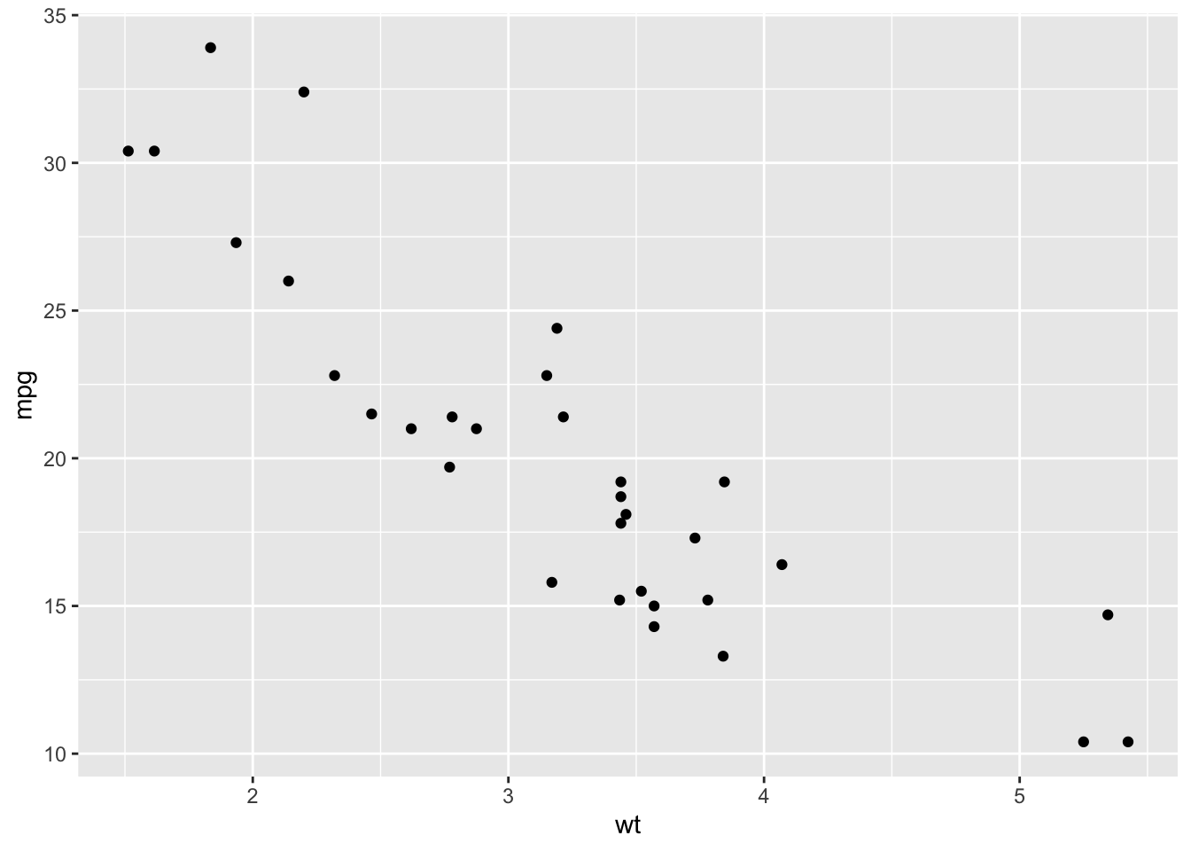
Figure: Simple Scatterplot
You’ll notice two things about the previous line of code:
- First, running it generated our scatterplot for us. This is because the DATA, AESTHETIC, AND GEOMETRY ELEMENTS ARE ALL that is REQUIRED to create a plot (and they’ve all been specified).
- Second, we didn’t have to specify any arguments inside the
geom_point()function. This is because it defaults to inheriting it’s values from the ggplot object we created. But, if we choose, we can go in and change these arguments.
3.3 Sometimes More is Better
We can also add additional geometries or aesthetics to our graph. Let’s edit some of our existing code.
ggplot(data = mtcars, mapping = aes(x = wt, y = mpg)) +
  geom_point() +
  geom_smooth(method = lm, se = FALSE)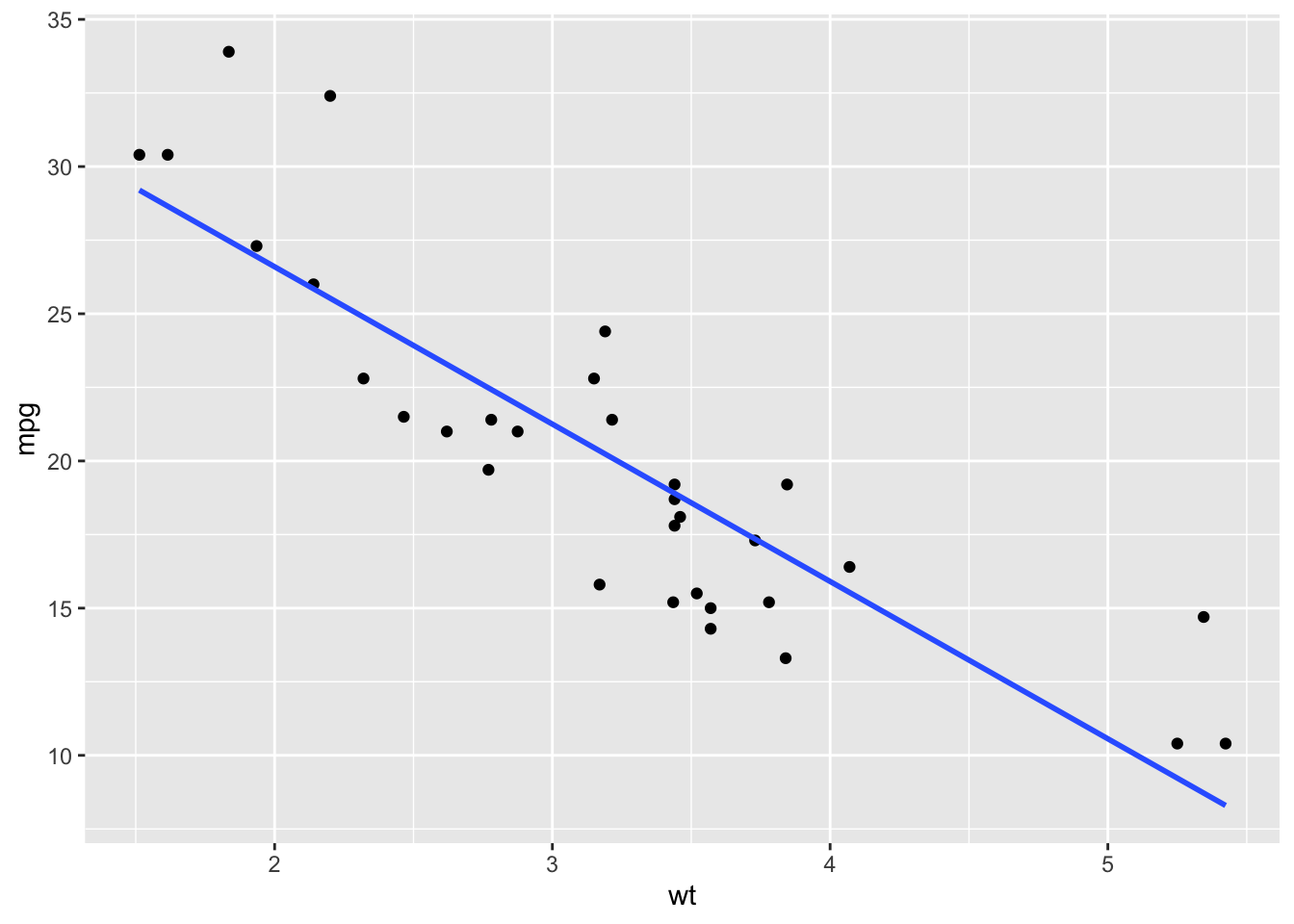
Figure: Regression Line
Here, we’ve added in the smooth geometry which adds a regression line to our graph. We’ve specified that we want the “method” to be “lm” and that we don’t want confidence intervals.
We can add additional aesthetics and geometries to change what our graphs display or how they display it.
Aesthetics can be used to specify how we want our graph to look. For instance, this code will make the data points in our scatterplot be red triangles. This is referred to as using the aesthetics as attributes.
ggplot(data = mtcars, mapping = aes(x = wt, y = mpg)) +
  geom_point(shape = 17, color = "red") +
  geom_smooth(method = lm, se = FALSE)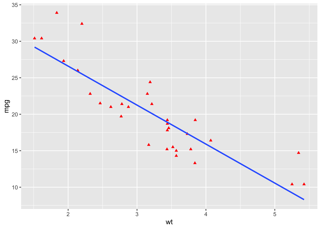
Figure: Red Triangles
But more importantly, aesthetics allow us to represent additional variables in our plots. For example, the following code allows us to color the points in our graph based off of the cylinder variable.
ggplot(data = mtcars, mapping = aes(x = wt, y = mpg, color = factor(cyl))) +
  geom_point() +
  geom_smooth(method = lm, se = FALSE)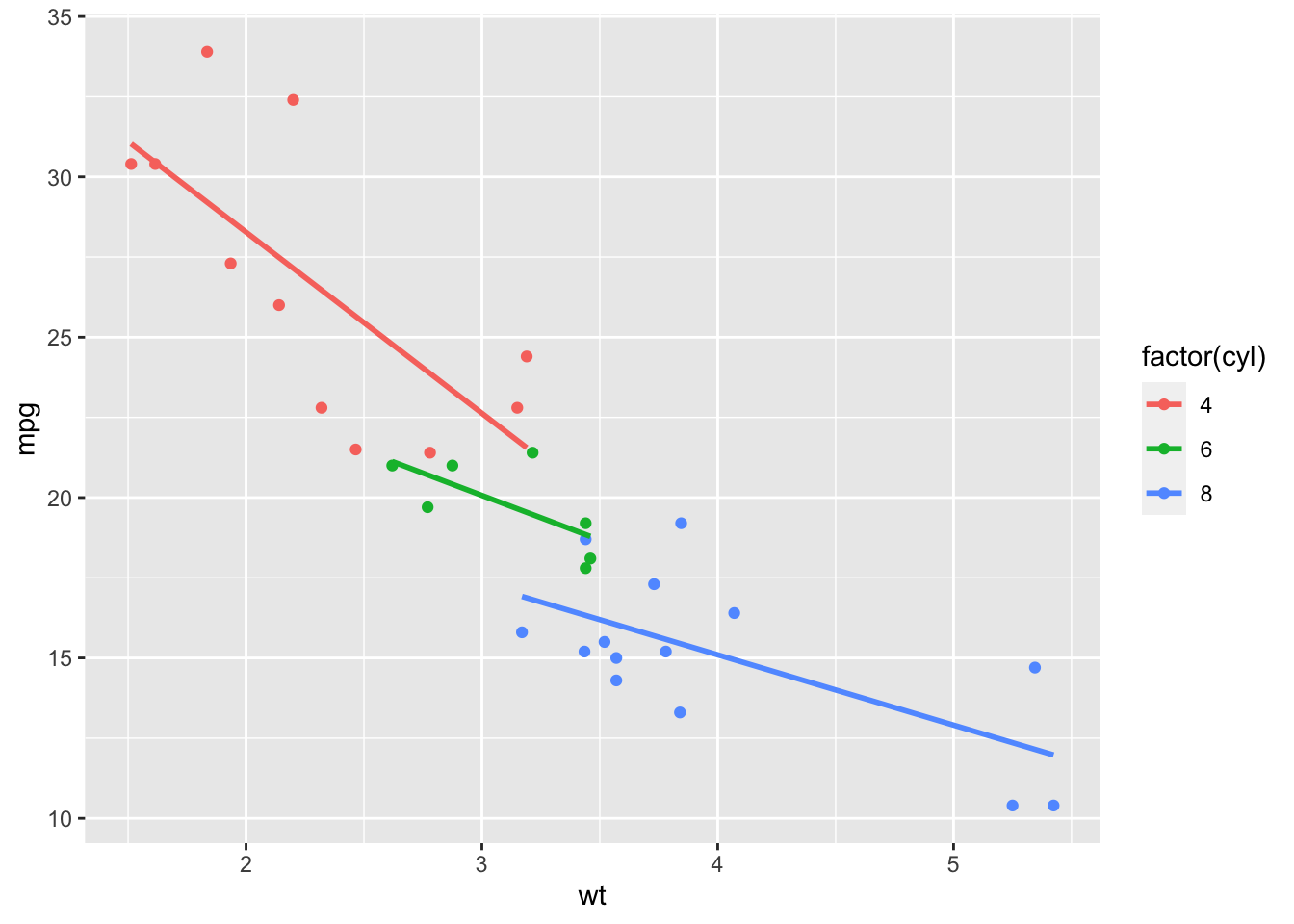
Figure: Color by Cylinders
Note: “cyl” was factored since it is a categorical variable.
Here, we’ve added an additional aesthetic to split our data by the number of cylinders in each engine and specified these groups using colors.
Additional aesthetic options include, but are not limited to: color, size, linetype, alpha, fill, and shape. (Some aesthetic options only work with certain types of graphs.)
3.3.1 To demonstrate a few more options:
ggplot(data = mtcars,
       mapping = aes(x = wt, y = mpg,
                     color = factor(cyl),
                     shape = factor(vs),
                     size = hp)) +
  geom_point() +
  geom_smooth(method = lm, se = FALSE)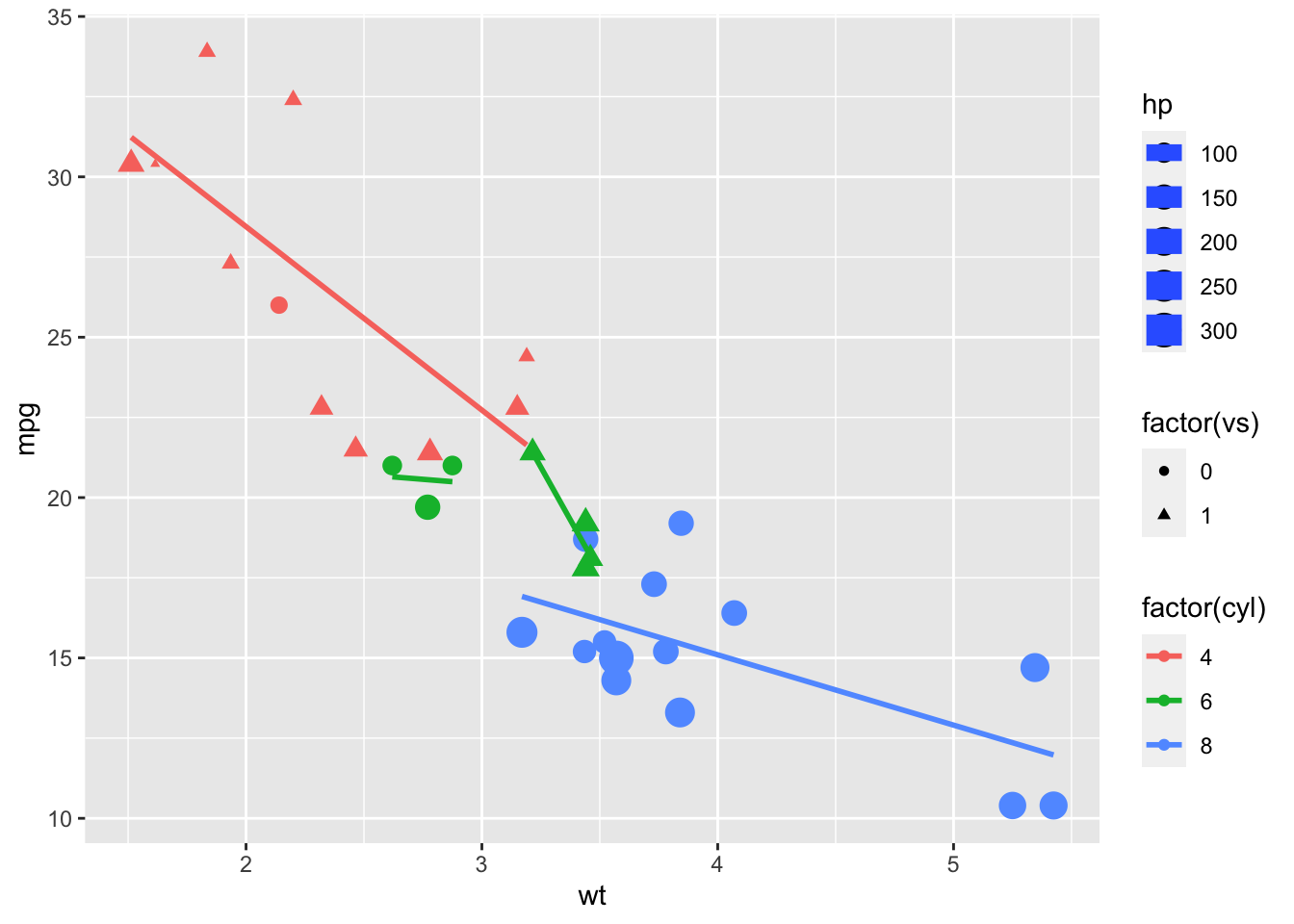
Figure: Varying Color, Shape, and Size
Notice that different groups (e.g., 6 cylinder with v-shaped and 6 cylinder straight) have their own regression lines.
4 More on Aesthetic Options
4.1 Color/Fill
In ggplot2, we are given a host of color options that we can choose to apply to our graphs. Here is a link to a good list to get you started on your coloring journey:
Here is one of our original graphs.
ggplot(data = mtcars, mapping = aes(x = wt, y = mpg, color = factor(cyl))) +
  geom_point() +
  geom_smooth(method = lm, se = FALSE)
Figure: Color by Cylinders
Let’s say we didn’t like the default colors. We can go in and choose the colors we want in various ways. One is to use scale_color_manual() (note that we use “color” because we used the “color” aesthetic; there are also options for “fill”).
ggplot(data = mtcars, mapping = aes(x = wt, y = mpg, color = factor(cyl))) +
  geom_point() +
  geom_smooth(method = lm, se = FALSE) +
  scale_color_manual("legend", values = c("4" = "black", "6" =
                                            "gray45", "8" = "white"))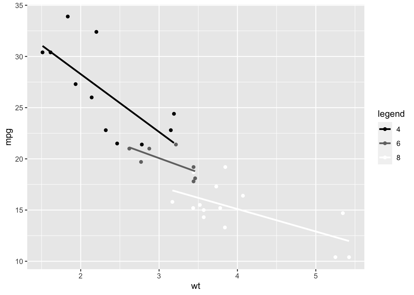
Figure: Manually Selecting Colors
We can also use prespecified color palettes. I personally like Dark2.
ggplot(data = mtcars, mapping = aes(x = wt, y = mpg, color = factor(cyl))) +
  geom_point() +
  geom_smooth(method = lm, se = FALSE) +
  scale_color_brewer(palette = "Dark2")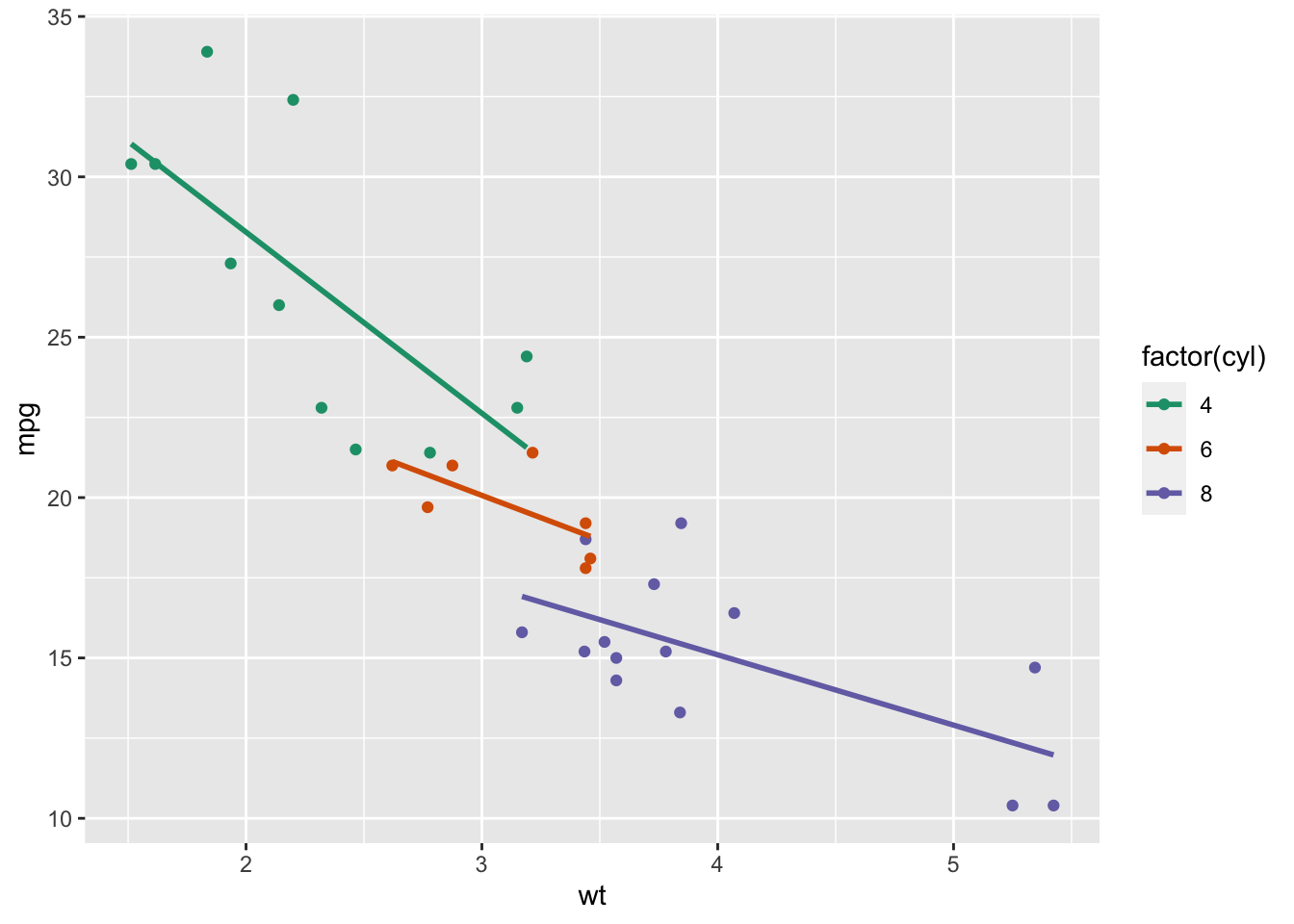
Figure: Using a Color Palette
The world is your oyster as far as color; you have a functionally infinite amount of options at your disposal.
4.2 Size
The size options in ggplot2 are more limited than the color options, but you really don’t need THAT many different size options.
Size options range from 1 - 6.
Note: Size is based on area, not radius.
ggplot(data = mtcars, mapping = aes(x = wt, y = mpg, color = factor(cyl))) +
  geom_point(size = 1) +
  geom_smooth(method = lm, se = FALSE)
Figure: Scatterplot Size 1
ggplot(data = mtcars, mapping = aes(x = wt, y = mpg, color = factor(cyl))) +
  geom_point(size = 3.5) +
  geom_smooth(method = lm, se = FALSE)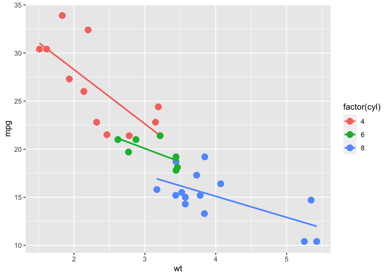
Figure: Scatterplot Size 3.5
ggplot(data = mtcars, mapping = aes(x = wt, y = mpg, color = factor(cyl))) +
  geom_point(size = 6) +
  geom_smooth(method = lm, se = FALSE)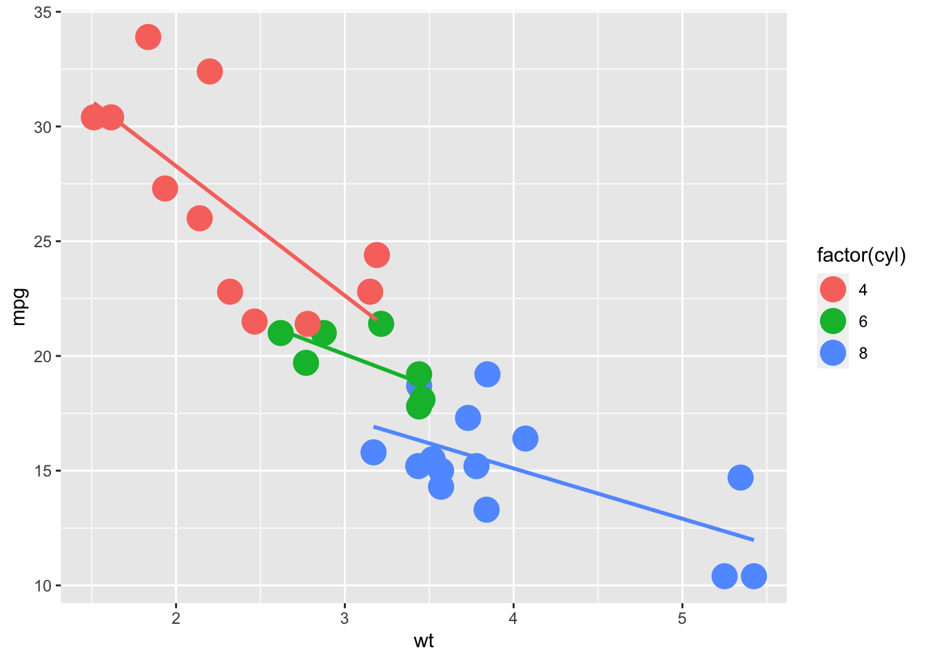
Figure: Scatterplot Size 6
Notice that we put the size code in the geom_*() that we’re wanting to edit.
4.3 Shape
We have more options with shape than we do size. We have numeric options that range from 0-25, as well as options for *, ., o, and O. My personal preference is 21, because the hollow circle allows us to easily get an idea of the density of the points.
ggplot(data = mtcars, mapping = aes(x = wt, y = mpg, color = factor(cyl))) +
  geom_point(shape = 0) +
  geom_smooth(method = lm, se = FALSE)
Figure: Scatterplot Shape 0
ggplot(data = mtcars, mapping = aes(x = wt, y = mpg, color = factor(cyl))) +
  geom_point(shape = 21) +
  geom_smooth(method = lm, se = FALSE)
Figure: Scatterplot Shape 21
ggplot(data = mtcars, mapping = aes(x = wt, y = mpg, color = factor(cyl))) +
  geom_point(shape = 25) +
  geom_smooth(method = lm, se = FALSE)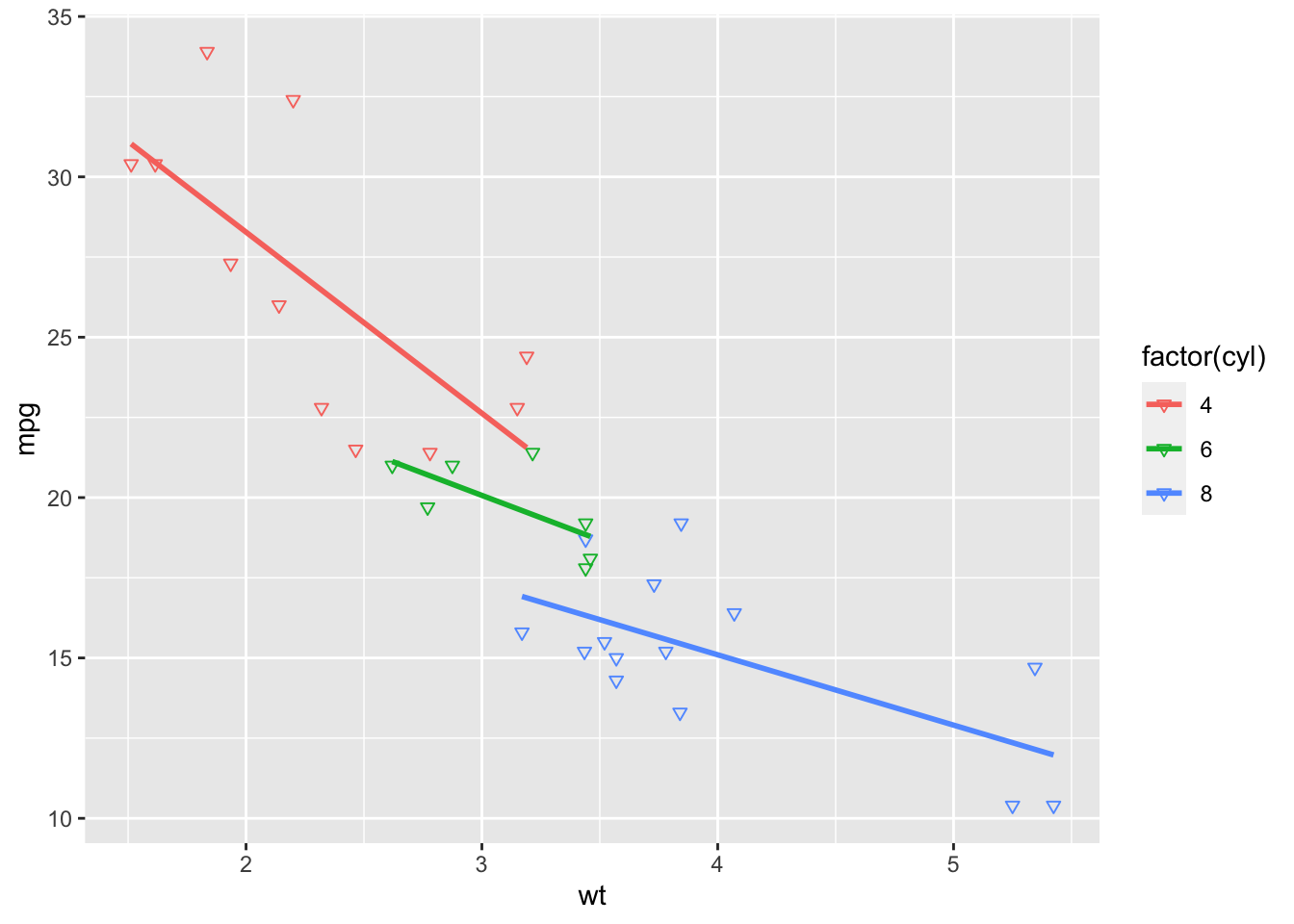
Figure: Scatterplot Shape 25
ggplot(data = mtcars, mapping = aes(x = wt, y = mpg, color = factor(cyl))) +
  geom_point(shape = "*", size = 6) +
  geom_smooth(method = lm, se = FALSE)
Figure: Scatterplot Shape * with size 6
ggplot(data = mtcars, mapping = aes(x = wt, y = mpg, color = factor(cyl))) +
  geom_point(shape = "o", size = 6) +
  geom_smooth(method = lm, se = FALSE)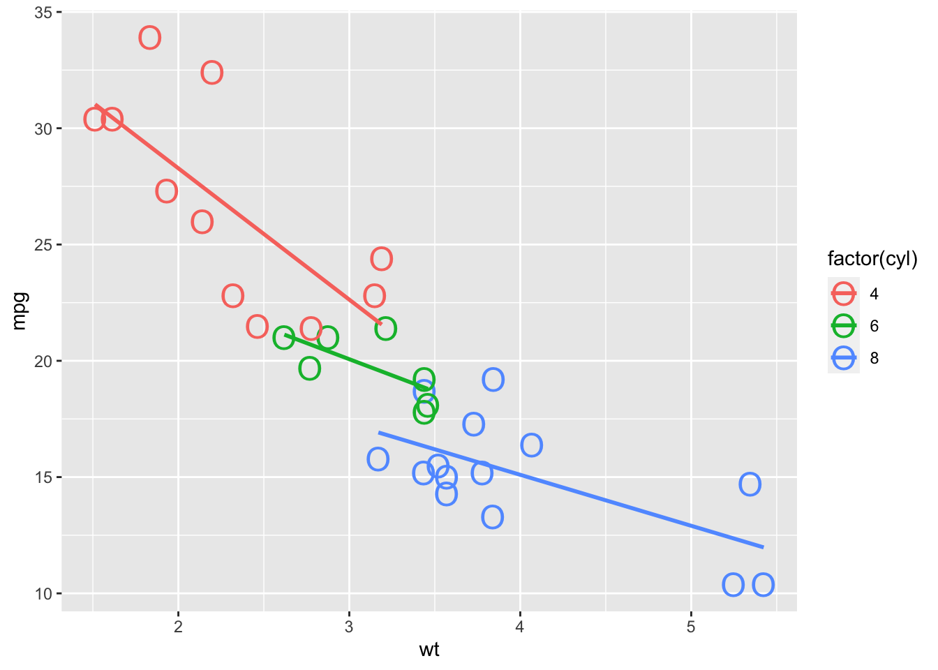
Figure: Scatterplot Shape o with size 6
ggplot(data = mtcars, mapping = aes(x = wt, y = mpg, color = factor(cyl))) +
  geom_point(shape = "O", size = 6) +
  geom_smooth(method = lm, se = FALSE)
Figure: Scatterplot Shape O with size 6
4.4 Linetype
We have 6 line types that I’m aware of, but we can mix and match them with colors and other aesthetics to increase the variety that we have. We’ll continue to work with the same basic graph that we’ve used up to this point even though using lines won’t be the prettiest or most informative.
Note: geom_line() will default to “solid.”
ggplot(data = mtcars, mapping = aes(x = carb, y = am, color = factor(cyl))) +
  geom_line() +
  geom_point()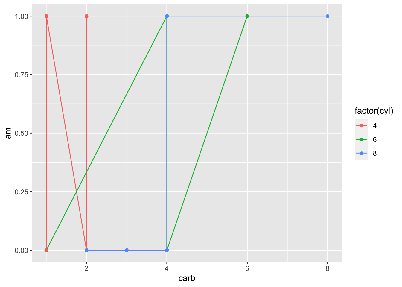
Figure: Line Graph Default
ggplot(data = mtcars, mapping = aes(x = carb, y = am, color = factor(cyl))) +
  geom_line(linetype = "twodash") +
  geom_point()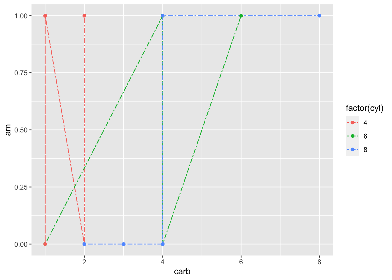
Figure: Line Graph Twodash
ggplot(data = mtcars, mapping = aes(x = carb, y = am, color = factor(cyl))) +
  geom_line(linetype = "longdash") +
  geom_point()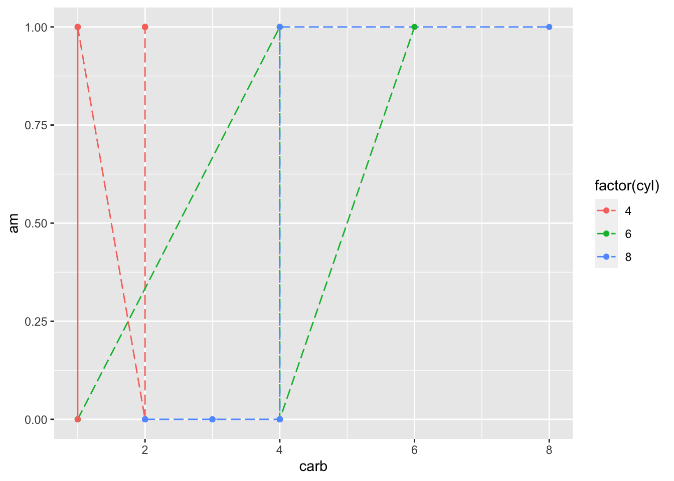
Figure: Line Graph Longdash
ggplot(data = mtcars, mapping = aes(x = carb, y = am, color = factor(cyl))) +
  geom_line(linetype = "dotted") +
  geom_point()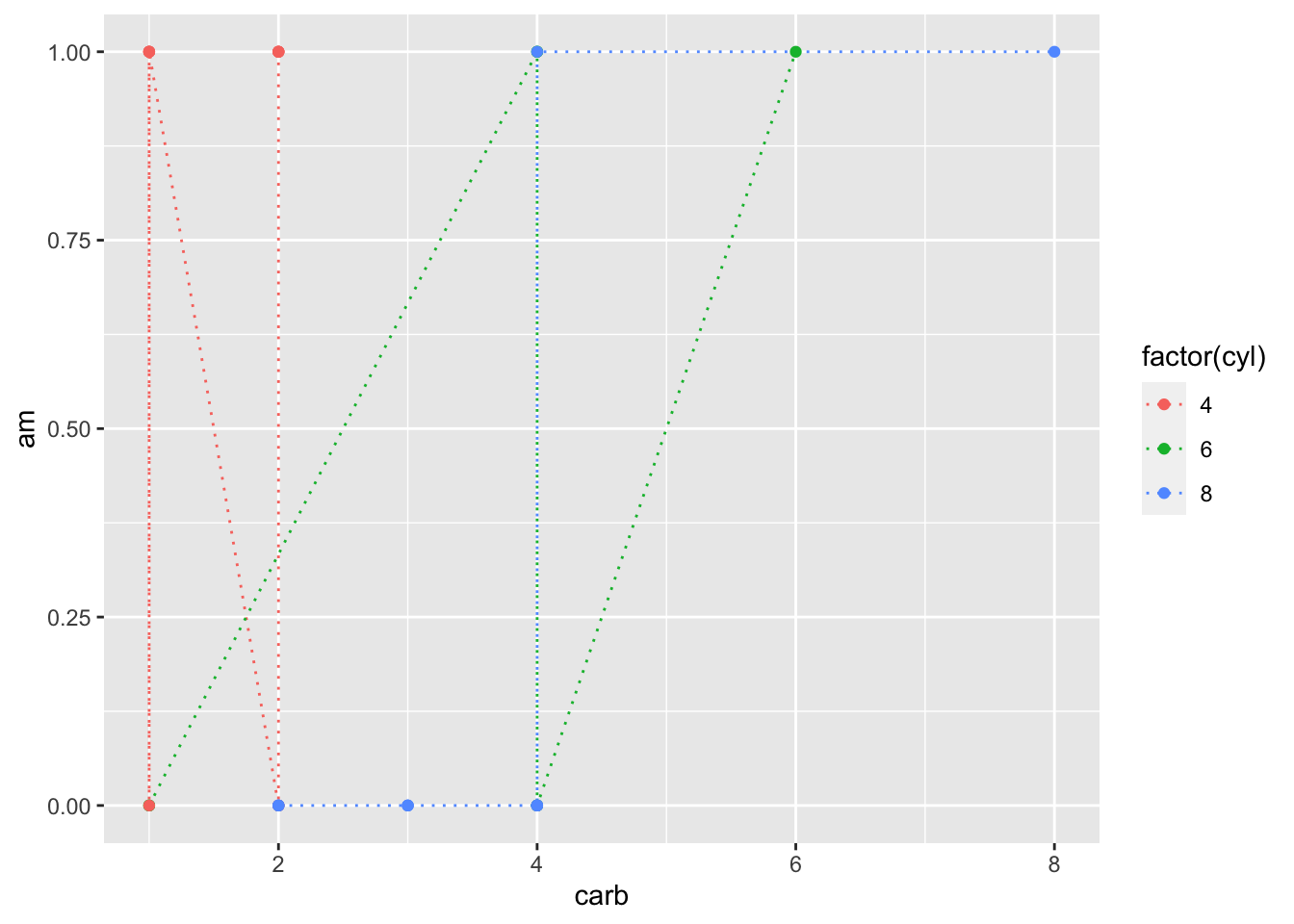
Figure: Line Graph Dotted
ggplot(data = mtcars, mapping = aes(x = carb, y = am, color = factor(cyl))) +
  geom_line(linetype = "dotdash") +
  geom_point()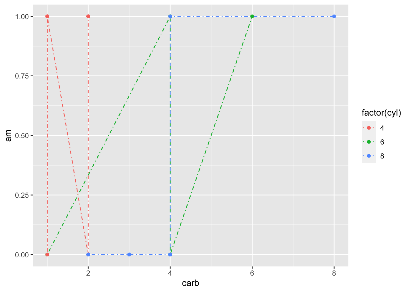
Figure: Line Graph Dotdash
ggplot(data = mtcars, mapping = aes(x = carb, y = am, color = factor(cyl))) +
  geom_line(linetype = "dashed") +
  geom_point()
Figure: Line Graph Dashed
If you ever need it, we technically also have “blank.”
ggplot(data = mtcars, mapping = aes(x = carb, y = am, color = factor(cyl))) +
  geom_line(linetype = "blank") +
  geom_point()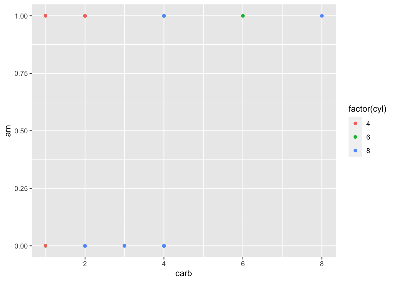
Figure: Line Graph Blank
4.5 Alpha
Alpha can be combined with nearly every other aspect of your graphs in ggplot2. The alpha values you assign affect the transparency of the associated elements. Values can range from 0 (completely transparent) to 1 (completely opaque).
ggplot(data = mtcars, mapping = aes(x = carb, y = am, color = factor(cyl))) +
  geom_line(linetype = "dashed", alpha = 0) +
  geom_point()
Figure: Line Graph with Alpha = 0
ggplot(data = mtcars, mapping = aes(x = carb, y = am, color = factor(cyl))) +
  geom_line(linetype = "dashed", alpha = 0.25) +
  geom_point()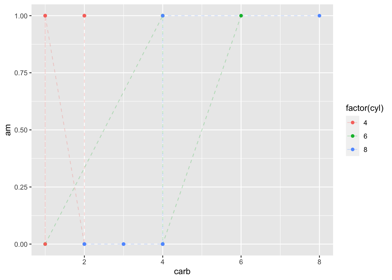
Figure: Line Graph with Alpha = 0.25
ggplot(data = mtcars, mapping = aes(x = carb, y = am, color = factor(cyl))) +
  geom_line(linetype = "dashed", alpha = 0.5) +
  geom_point()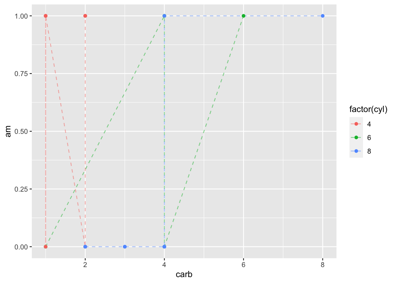
Figure: Line Graph with Alpha = 0.5
ggplot(data = mtcars, mapping = aes(x = carb, y = am, color = factor(cyl))) +
  geom_line(linetype = "dashed", alpha = 0.75) +
  geom_point()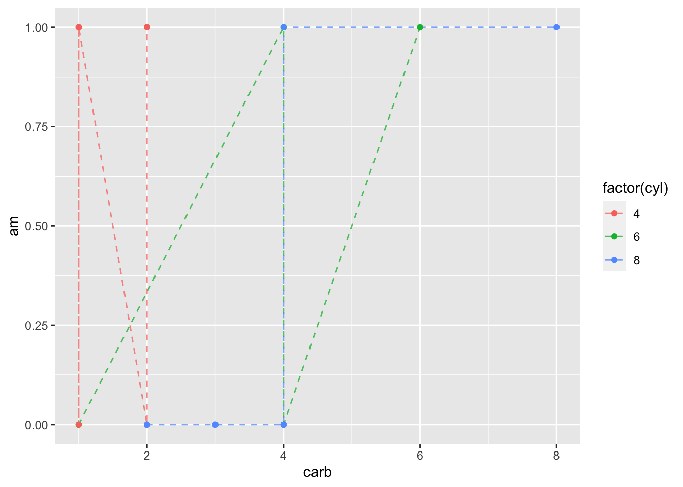
Figure: Line Graph with Alpha = 0.75
ggplot(data = mtcars, mapping = aes(x = carb, y = am, color = factor(cyl))) +
  geom_line(linetype = "dashed", alpha = 1) +
  geom_point()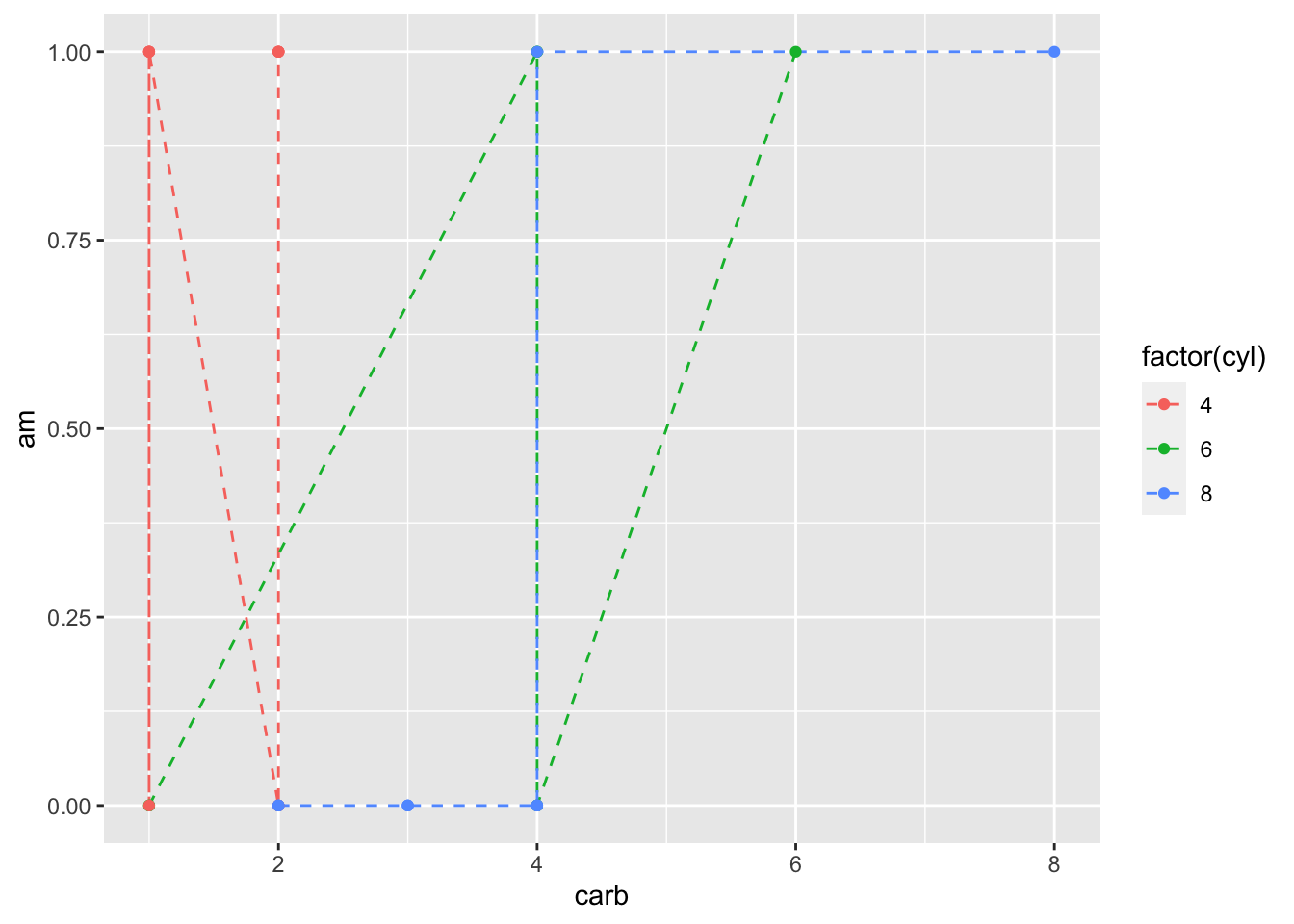
Figure: Line Graph with Alpha = 1
5 Additional Elements
5.1 Facets
As mentioned earlier, facets allow us to plot multiple similar plots. This allows us to “split plots” by a variable (another handy way for us to plot additional variables).
In this code (which is similar to the previous), we’ll facet our graph by cylinder number instead of coloring it by cylinder.
ggplot(data = mtcars,
       mapping = aes(x = wt, y = mpg,
                     color = hp,
                     shape = factor(vs))) +
  geom_point() +
  geom_smooth(method = lm, se = FALSE) +
  facet_wrap(facets = ~ cyl)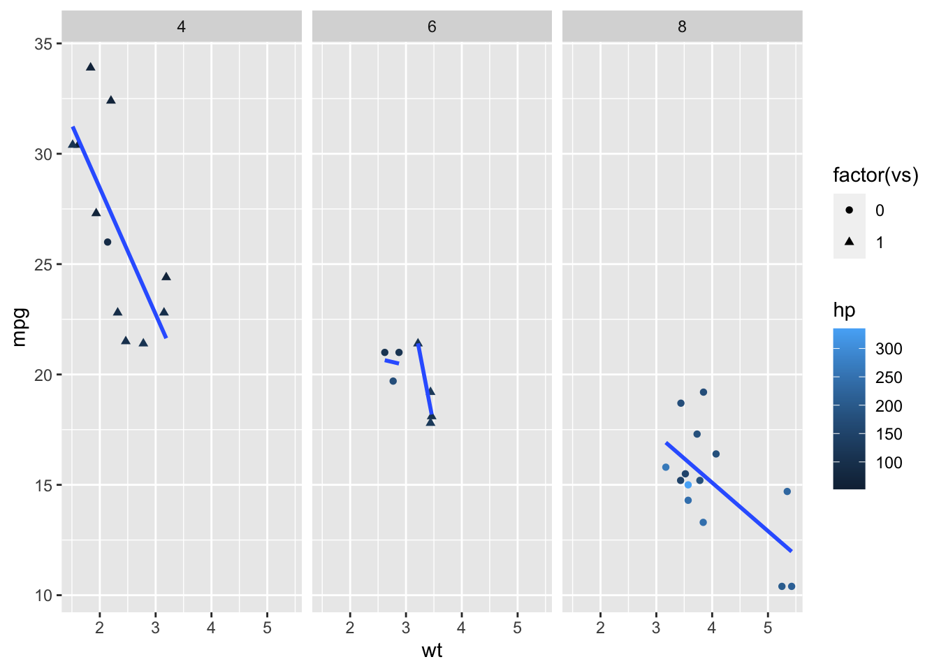
Figure: Scatterplot Faceted by Cylinders
As you can see, this generated a graph for each level of cyl and put them all on the same scale for easy comparison.
5.2 Statistics
Statistics are additional arguments that we can specify in ggplot2 code that specify how we want to display our data. You’ll likely notice that many stat_*() and geom_*() functions have similar names.
In practice in ggplot2, geom_*() and stat_*() are largely interchangeable - that is, you can use one or the other. However, your code will be formatted differently depending on which you choose to use.
Let’s rewrite some of our earlier code using stat_smooth() instead of geom_smooth(). We’ll also add a regression line for the data if not split on cyl.
ggplot(data = mtcars, mapping = aes(x = wt, y = mpg, color = factor(cyl))) +
  geom_point() +
  stat_smooth(method = lm, se = FALSE) +
  stat_smooth(method = lm, se = FALSE, formula = y ~ x, color = "black")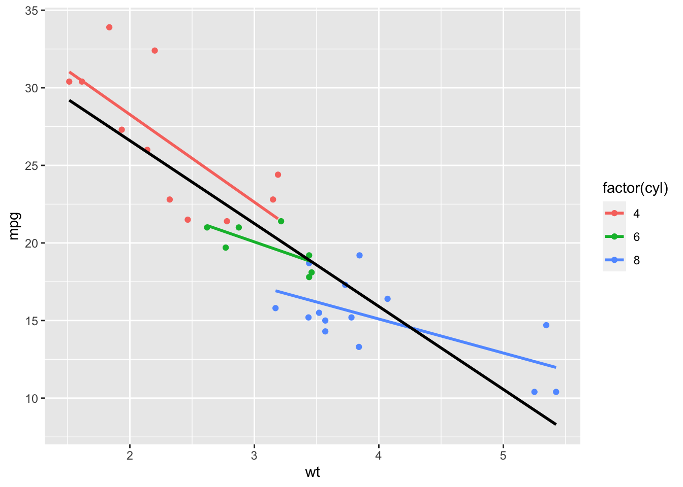
Figure: Regression Lines from stat_smooth()
5.3 Coordinates
Like mentioned earlier, coordinates are where we display our data - that is, the values of the coordinate (typically x, y) planes of our graphs.
Like geometries and statistics, there are many coordinate functions to explore in the ggplot2 package. Let’s take a closer look at a few of these functions that are commonly used. With the last graph that we made in mind, let’s use a function to zoom in on just weight from 3 to 4.
ggplot(data = mtcars, mapping = aes(x = wt, y = mpg, color = factor(cyl))) +
  geom_point() +
  stat_smooth(method = lm, se = FALSE) +
  stat_smooth(method = lm, se = FALSE, formula = y ~ x, color = "black") +
  coord_cartesian(xlim = c(3, 4))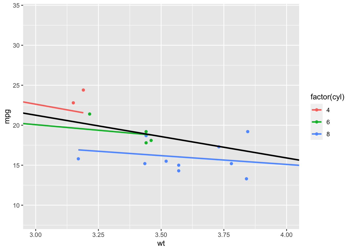
Figure: Using coord_cartesian to Zoom
As you noticed, the regression lines continued outside of the graphed area. This is because the coord_cartesian() function doesn’t filter out the unused data. Next, we’ll look at a function that will filter that data for us.
ggplot(data = mtcars, mapping = aes(x = wt, y = mpg, color = factor(cyl))) +
  geom_point() +
  stat_smooth(method = lm, se = FALSE) +
  stat_smooth(method = lm, se = FALSE, formula = y ~ x, color = "black") +
  scale_x_continuous(limits = c(3, 4))
## `geom_smooth()` using formula 'y ~ x'## Warning: Removed 16 rows containing non-finite values (stat_smooth).
## Warning: Removed 16 rows containing non-finite values (stat_smooth).## Warning: Removed 16 rows containing missing values (geom_point).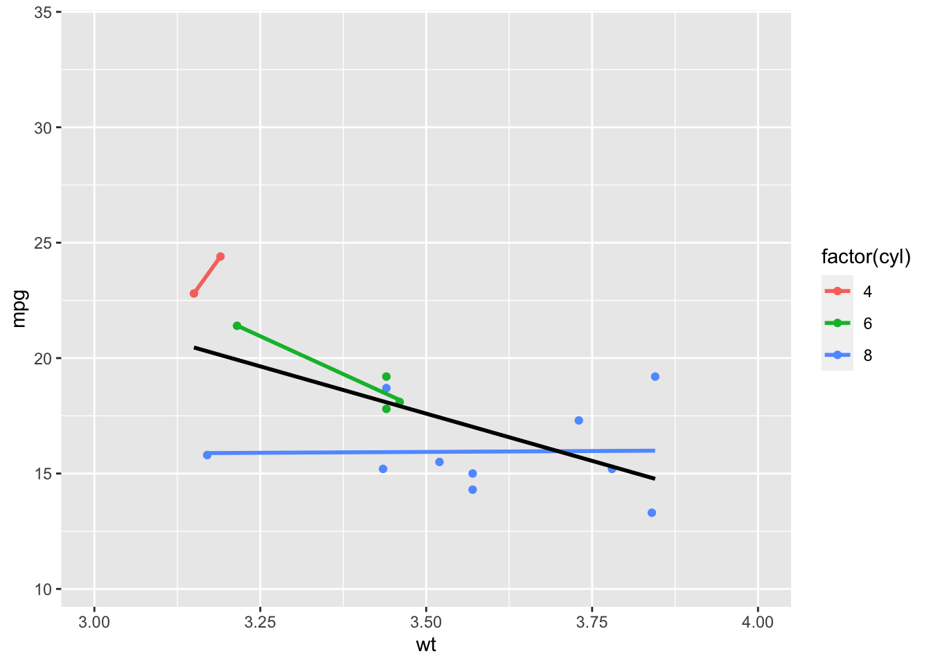
Figure: Zooming by Changing the Scale
This is handy if we’re only interested in what is going on in this section, but not the sections to either side, because, as you hopefully noticed, our lines changed. That’s because this code filters out the unused data (hence the warning messages).
There are also coordinate functions that allow for transformations of the variables on the x- and y-axis. For example, we can perform a log transform on our new x-variable disp.
ggplot(data = mtcars, mapping = aes(x = disp, y = mpg, color = factor(cyl))) +
  geom_point() +
  stat_smooth(method = lm, se = FALSE) +
  stat_smooth(method = lm, se = FALSE, formula = y ~ x, color = "black") +
  scale_x_log10()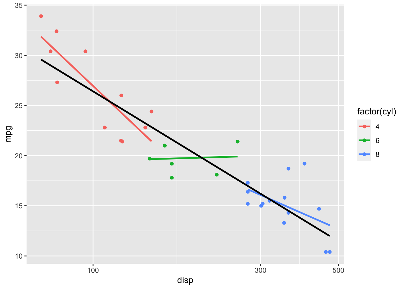
Figure: Log Transform on x-axis
And we could also do a square-root transformation on the y-axis.
ggplot(data = mtcars, mapping = aes(x = disp, y = mpg, color = factor(cyl))) +
  geom_point() +
  stat_smooth(method = lm, se = FALSE) +
  stat_smooth(method = lm, se = FALSE, formula = y ~ x, color = "black") +
  scale_x_log10() +
  scale_y_sqrt()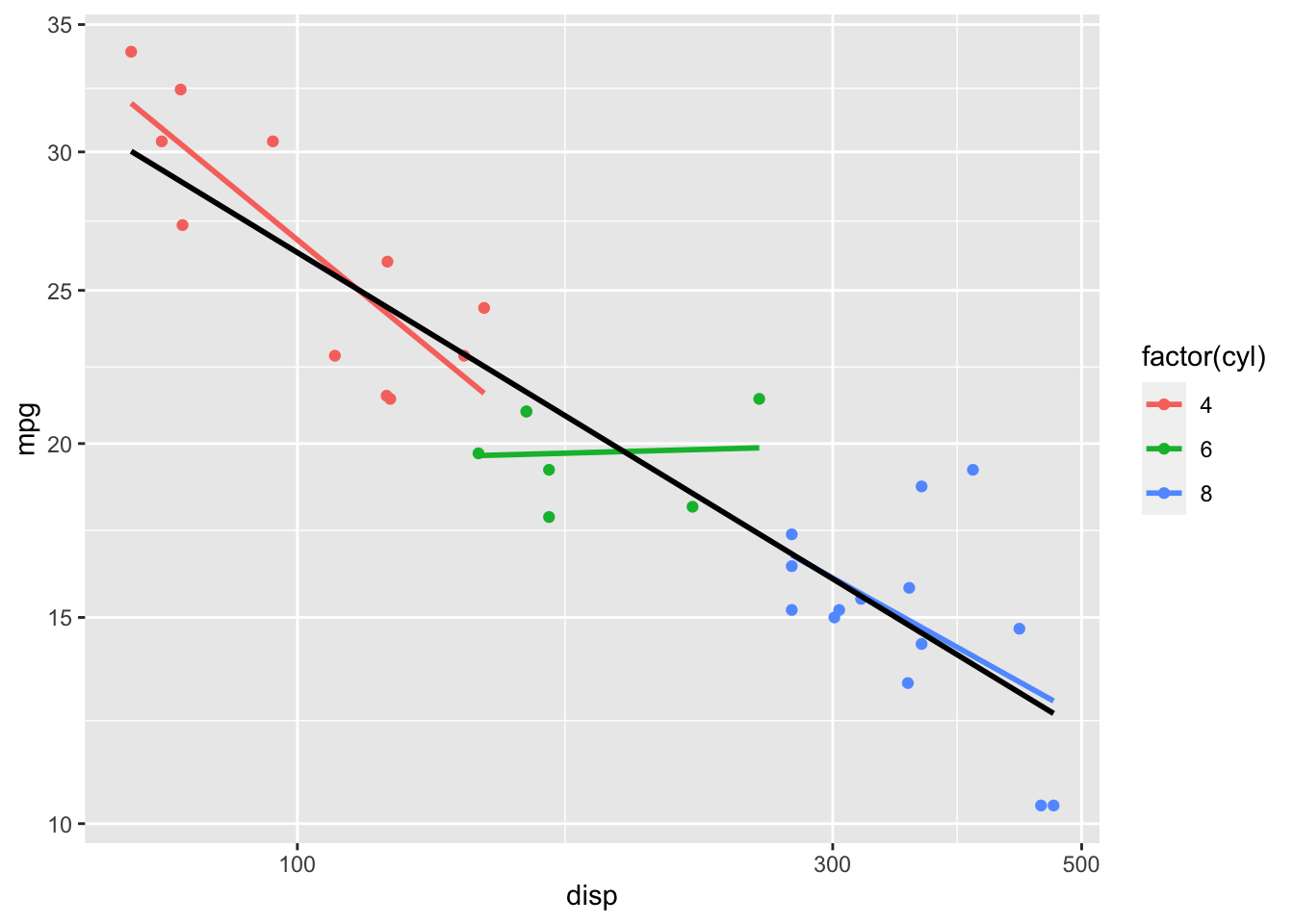
Figure: Log Transform x, Squareroot Transform y
A sometimes handy transformation is the reverse transformation which will perform as advertised - reversing the axis.
ggplot(data = mtcars, mapping = aes(x = wt, y = mpg, color = factor(cyl))) +
  geom_point() +
  stat_smooth(method = lm, se = FALSE) +
  stat_smooth(method = lm, se = FALSE, formula = y ~ x, color = "black") +
  scale_x_reverse()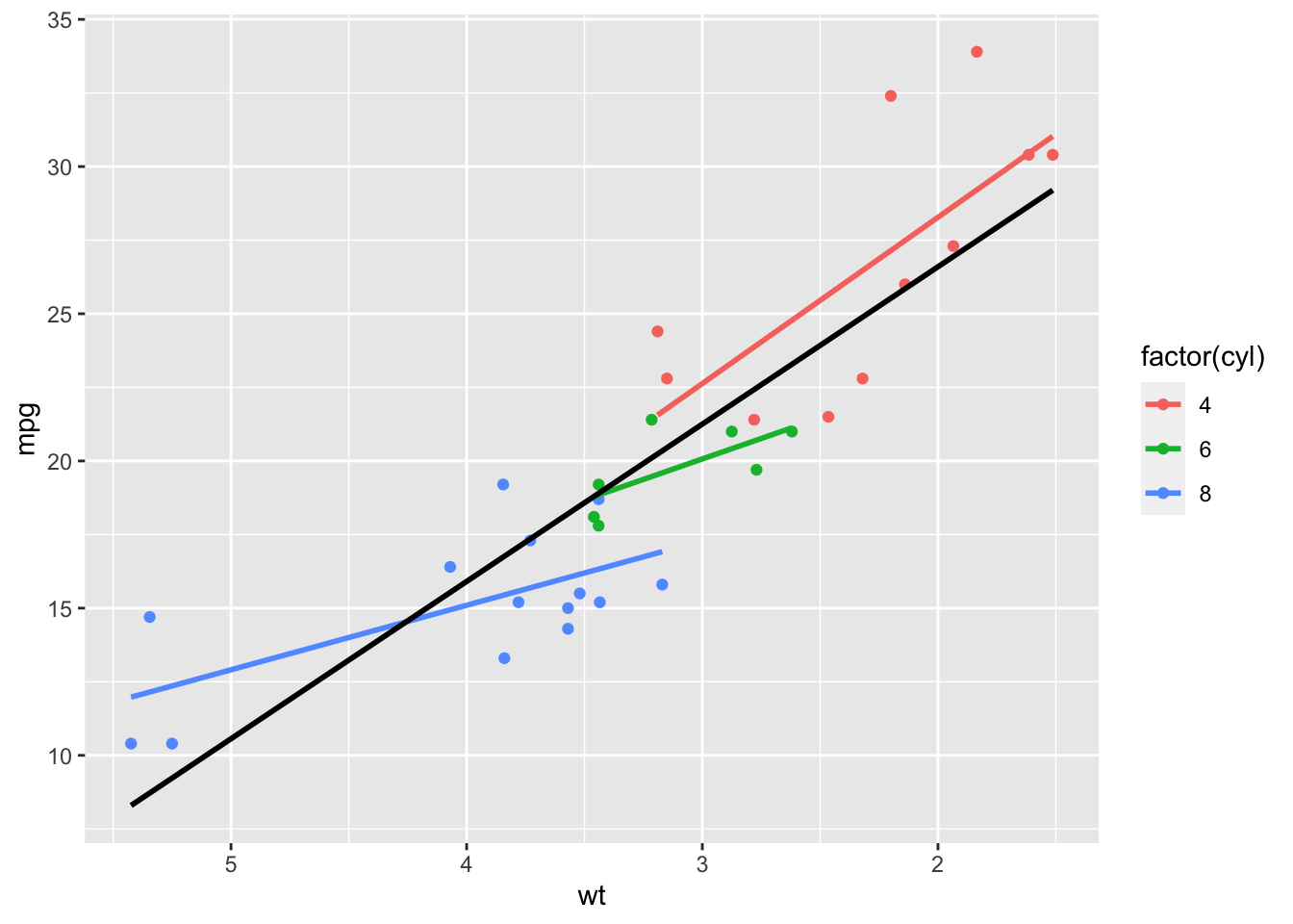
Figure: x-axis Reversed
5.4 Themes
Themes allow us to modify the appearance of the elements of our graphs that aren’t data. There are many pregenerated themes() in ggplot2. Such as:
theme_bw()
ggplot(data = mtcars, mapping = aes(x = wt, y = mpg)) +
  geom_point() +
  geom_smooth(method = lm, se = FALSE) +
  theme_bw()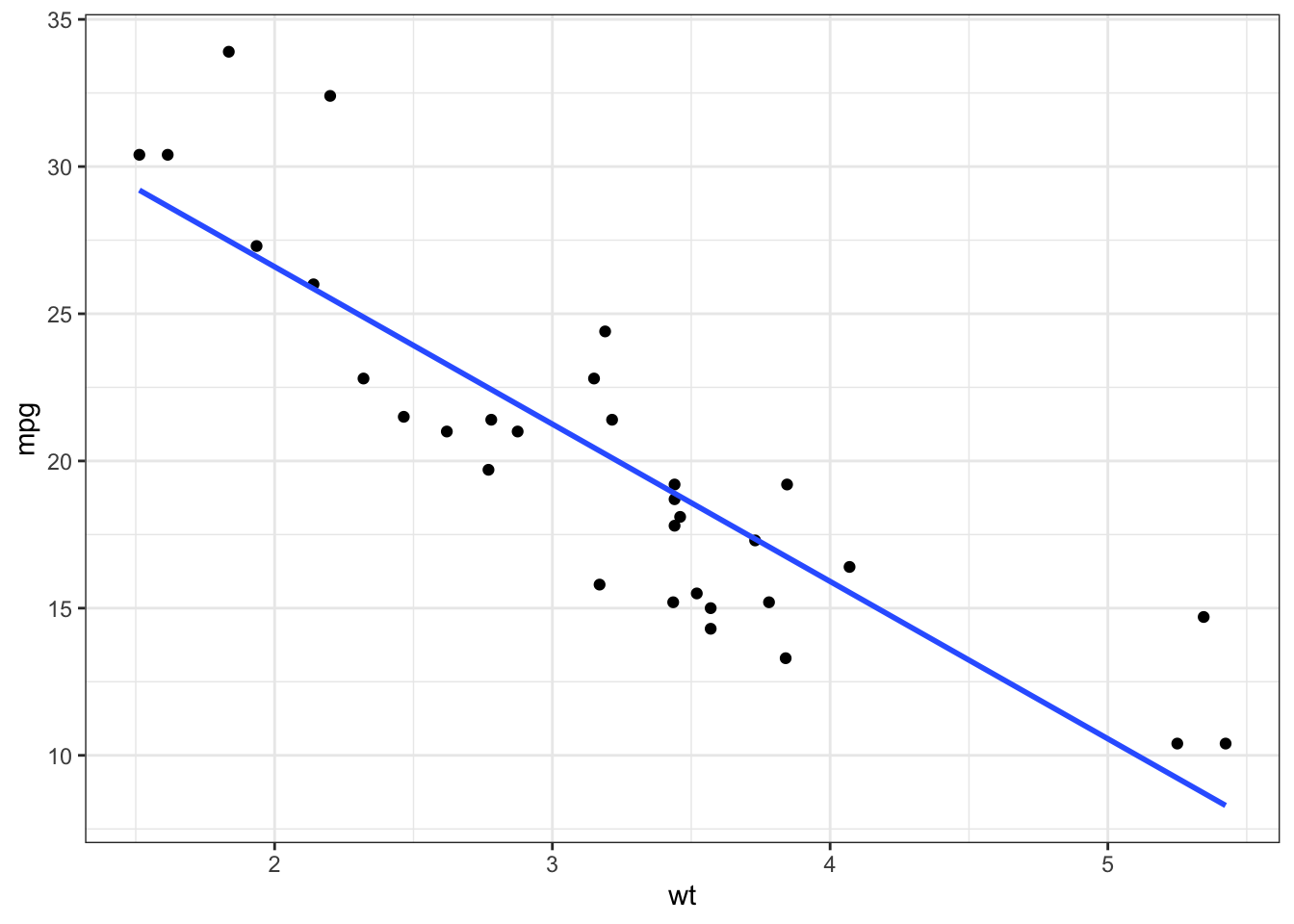
Figure: Scatterplot with Black and White Theme
theme_void()
ggplot(data = mtcars, mapping = aes(x = wt, y = mpg)) +
  geom_point() +
  geom_smooth(method = lm, se = FALSE) +
  theme_void()
Figure: Scatterplot with Void Theme
- but probably the most useful to you will be
theme_apa(), which comes to us from the jtools package.This will make good looking APA format figures.
ggplot(data = mtcars, mapping = aes(x = wt, y = mpg)) +
  geom_point() +
  geom_smooth(method = lm, se = FALSE) +
  theme_apa()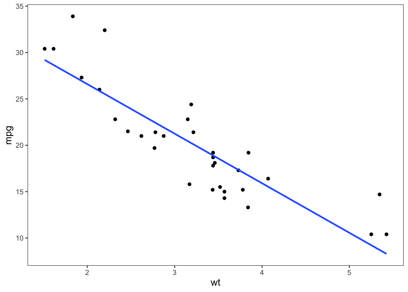
Figure: Scatterplot with APA Theme
You can also pick and choose to add certain theme elements without using a whole theme. For example, adding labels to your graphs.
ggplot(data = mtcars, mapping = aes(x = wt, y = mpg)) +
  geom_point() +
  geom_smooth(method = lm, se = FALSE) +
  theme_apa() +
  labs(x = "Weight", y = "Miles Per Gallon (mpg)")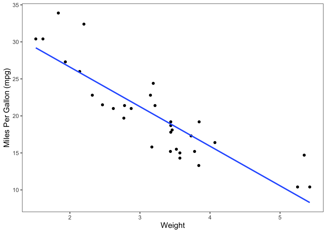
Figure: Scatterplot with APA Theme and Axis Labels