Graphing in GGplot2
Original Author: Kyle R. Ripley
Updated on 6/25/2020 by Kyle R. Ripley
1 Overview
In this tutorial, we’ll cover how to generate commonly used graphs by implementing the information you learned in the previous tutorial (Intro to GGplot2). We will not examine EVERY specific combination of functions possible, so in the future, you’ll need to be comfortable editing the code presented here in order to make your desired graphs. Additionally, this tutorial will cover how to make some specialized graphs inside of ggplot2 and other packages.
1.1 Packages (and versions) used in this document
## [1] "R version 4.0.2 (2020-06-22)"## Package Version
## tidyverse 1.3.0
## ggplot2 3.3.2
## jtools 2.1.0
## RColorBrewer 1.1-2
## carData 3.0-4
## ggcorrplot 0.1.3
## Hmisc 4.4-0
## reshape2 1.4.4
## plyr 1.8.6
## ggExtra 0.9
## GGally 2.0.01.2 Optional readings
The Grammar of Graphics (Wilkinson, 1999)
A Layered Grammar of Graphics (Wickham, 2010)
2 Basic Types of Graphs
2.1 Scatterplots
You’re already pretty familiar with scatterplots from the previous tutorial. However, we’ll go ahead and cover them here.
Here is a simple scatterplot that plots sepal length against sepal width in the iris data.
ggplot(data = iris, mapping = aes(x = Sepal.Length, y = Sepal.Width)) +
  geom_point() +
  theme_apa() +
  labs(x = "Sepal Length", y = "Sepal Width")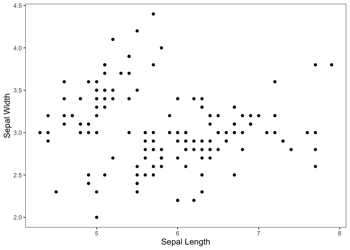
Figure: Simple scatterplot.
We can also add species to the color aesthetic to get a better picture of the data. And let’s go ahead and add in my favorite shape and move the legend.
ggplot(data = iris, mapping = aes(x = Sepal.Length, y = Sepal.Width, color = Species)) +
  geom_point(shape = 21) +
  theme_apa(legend.pos = "bottom") +
  labs(x = "Sepal Length", y = "Sepal Width")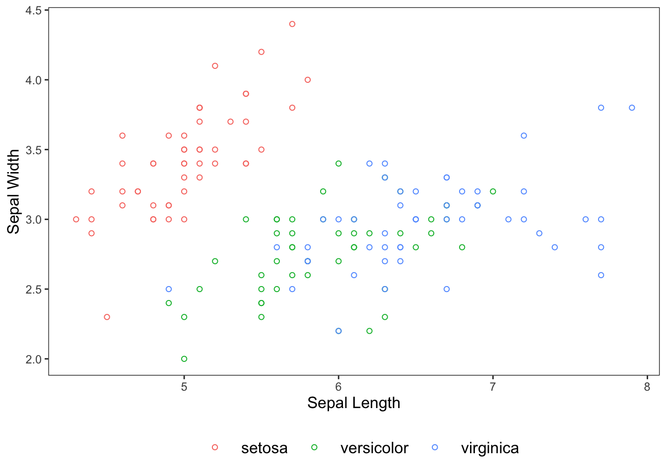
Figure: Scatterplot colored by species.
Or if you so wish, we can facet by Species instead of assigning it to the color aesthetic.
ggplot(data = iris, mapping = aes(x = Sepal.Length, y = Sepal.Width)) +
  geom_point(shape = 21) +
  theme_apa(legend.pos = "bottom") +
  facet_wrap(~ Species) +
  labs(x = "Sepal Length", y = "Sepal Width")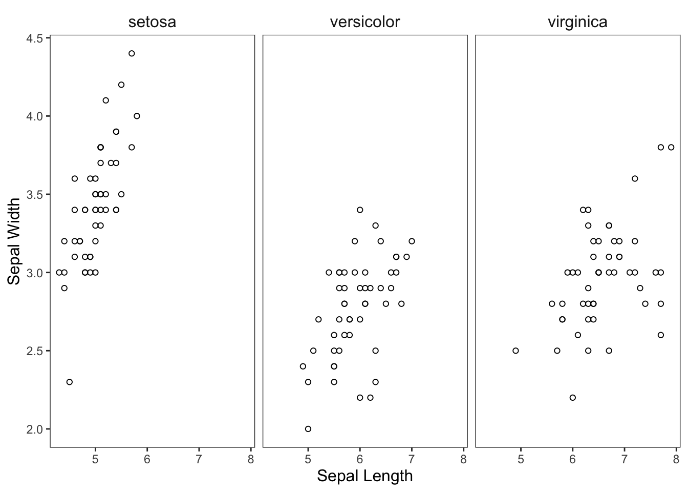
Figure: Scatterplot faceted by species.
Or why not both?
ggplot(data = iris, mapping = aes(x = Sepal.Length, y = Sepal.Width, color = Species)) +
  geom_point(shape = 21) +
  theme_apa(legend.pos = "bottom") +
  facet_wrap(~ Species) +
  scale_color_brewer(palette = "Dark2") +
  labs(x = "Sepal Length", y = "Sepal Width")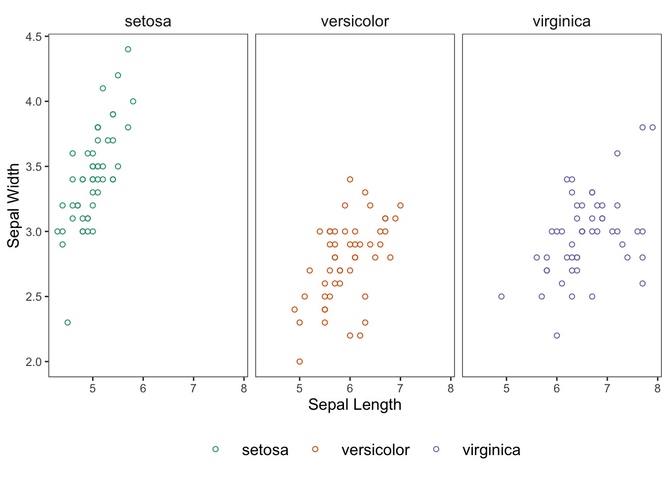
Figure: Scatterplot colored and faceted by species.
We’ve gotten quite familiar with scatterplots up to this point, but an additional geom_*() that you may want to consider adding to your scatterplots is geom_jitter(). This is handy when your data fall on specific discrete values. Like with:
ggplot(data = mtcars, mapping = aes(x = cyl, y = carb)) +
  geom_point() +
  theme_apa() +
  labs(x = "# of Cylinders", y = "# of Carburetors")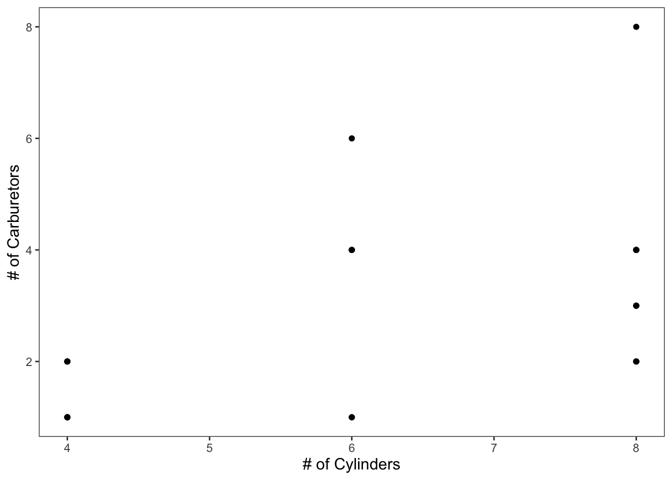
Figure: Simple scatterplot without jittered points.
geom_jitter() adds some variation into your data that allows you to better see the clusters of points.
ggplot(data = mtcars, mapping = aes(x = cyl, y = carb)) +
  geom_point() +
  geom_jitter() +
  theme_apa() +
  labs(x = "# of Cylinders", y = "# of Carburetors")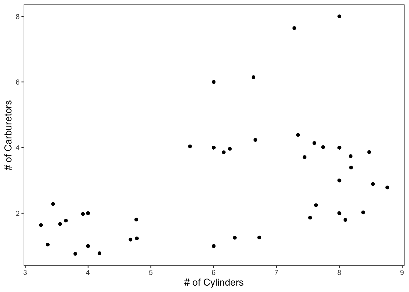
Figure: Simple scatterplot with jittered points.
An example with color as a factor of gear and regression lines for each group.
ggplot(data = mtcars, mapping = aes(x = cyl, y = mpg, color = factor(gear))) +
  geom_point() +
  geom_jitter() +
  geom_smooth(method = lm, se = FALSE) +
  scale_color_brewer(palette = "Dark2") +
  theme_apa(legend.pos = "bottom", legend.use.title = TRUE) + # theme_apa defaults this to FALSE
  labs(x = "# of Cylinders", y = "Miles Per Gallon (mpg)", color = "# of Gears")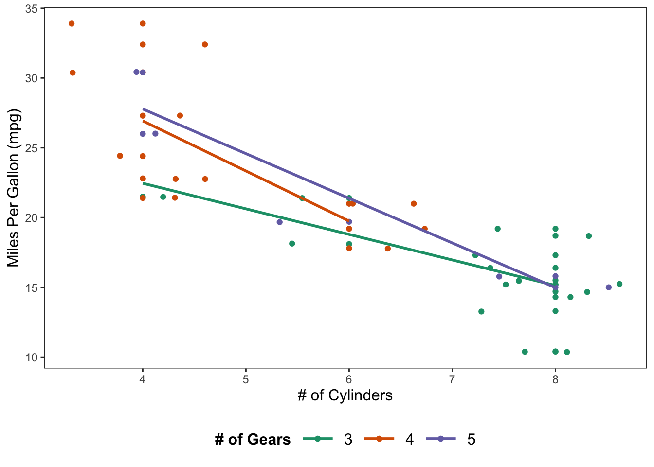
Figure: Scatterplot with jittered points and regression lines.
2.2 Histograms
Histograms display the values of a variable on the x-axis and their respective frequencies on the y-axis. This can be accomplished using geom_histogram().
ggplot(data = mtcars, mapping = aes(x = carb)) +
  geom_histogram() +
  theme_apa() +
  labs(x = "# of Carburetors")
## `stat_bin()` using `bins = 30`. Pick better value with `binwidth`.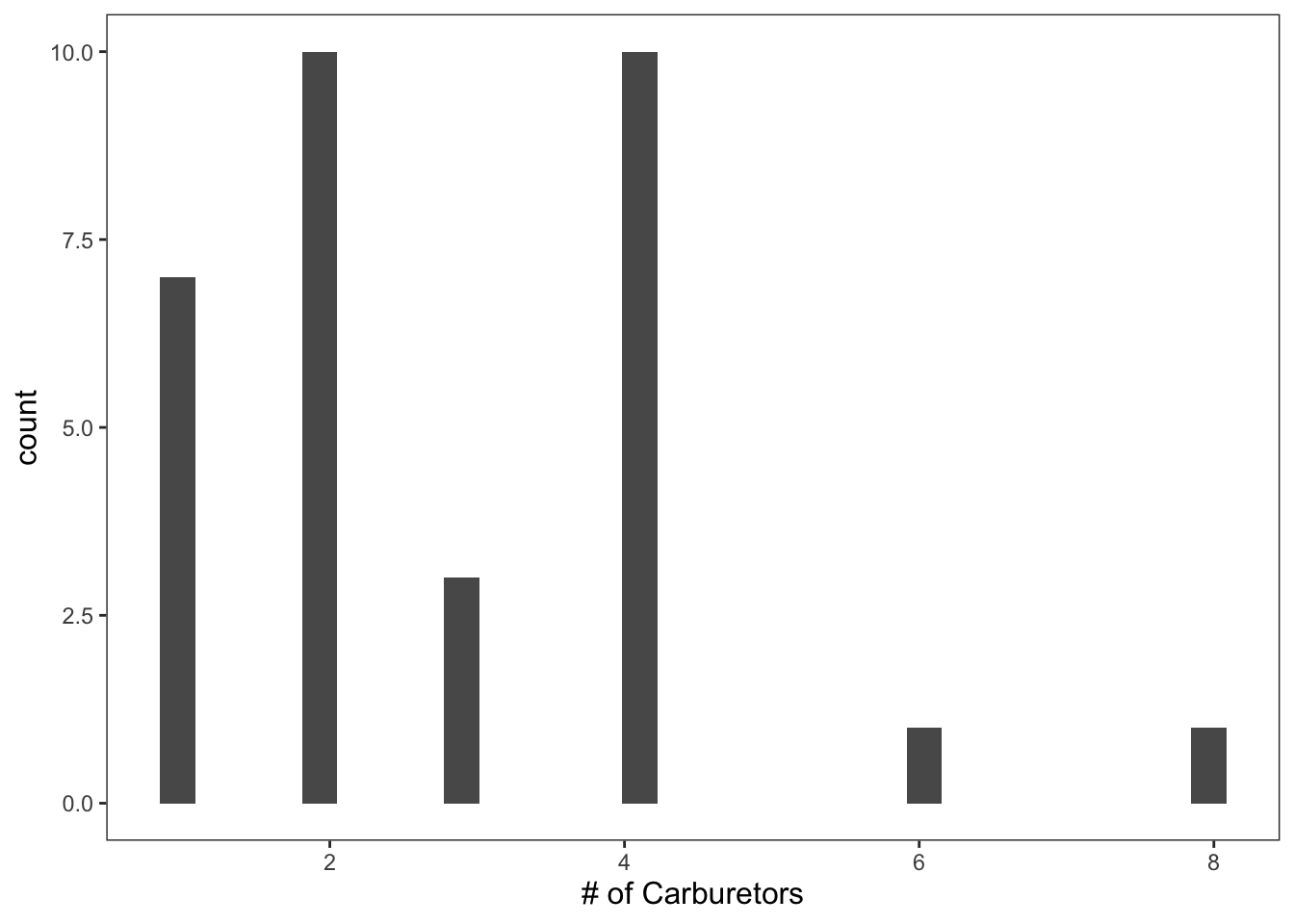
Figure: Histogram with default bins.
You’ll notice that any time you create a histogram you’ll get the following warning: “'stat_bin()' using 'bins = 30'. Pick better value with 'binwidth'.” This is because we haven’t specified the number of bins we want our data to be sorted into.
Since carb ranges from 1 - 8, we’ll specify that we want 8 bins.
ggplot(data = mtcars, mapping = aes(x = carb)) +
  geom_histogram(bins = 8, color = "black", fill = "white") +
  theme_apa() +
  labs(x = "# of Carburetors")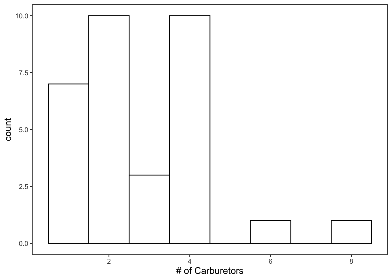
Figure: Histogram with custom bins.
That looks much better.
2.3 Density Plots
Density plots display very similar information as the histograms.
ggplot(data = mtcars, mapping = aes(x = carb)) +
  geom_density() +
  theme_apa() +
  labs(x = "# of Carburetors")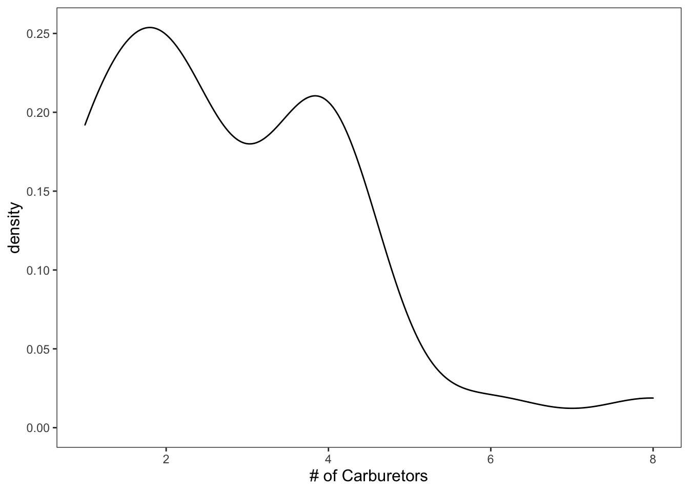
Figure: Black and white density plot.
As always, you can add color and what-not.
ggplot(data = mtcars, mapping = aes(x = carb)) +
  geom_density(color = "blue", fill = "skyblue") +
  theme_apa() +
  labs(x = "# of Carburetors")
Figure: Density plot with color.
NOTE: some graphs only allow certain aesthetics. Let’s try to add “shape” to this graph.
ggplot(data = mtcars, mapping = aes(x = carb)) +
  geom_density(color = "blue", fill = "skyblue", shape = 13) +
  theme_apa() +
  labs(x = "# of Carburetors")
## Warning: Ignoring unknown parameters: shape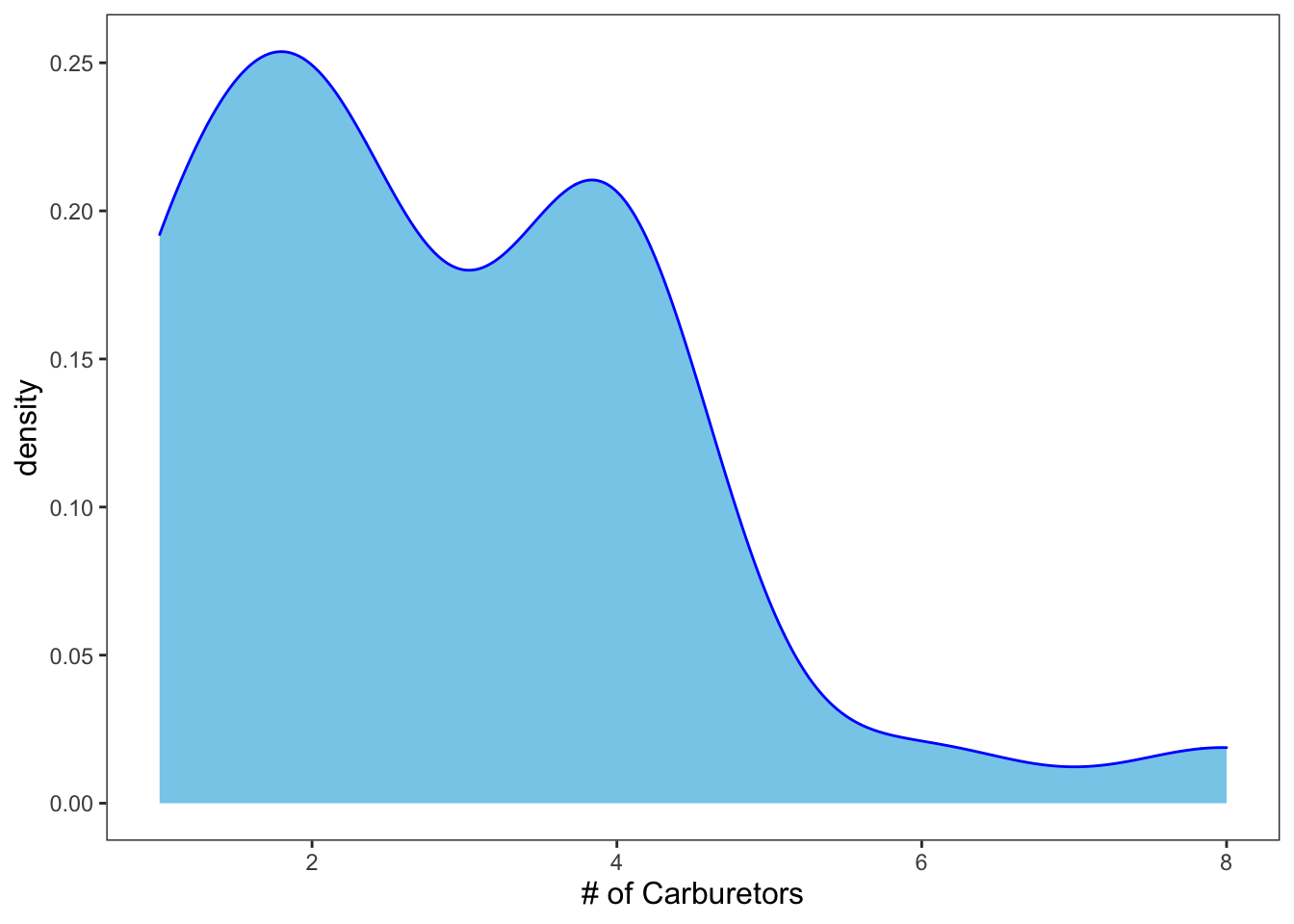
Figure: Density plot with shape.
2.4 Box Plots
Boxplots allow you to get a quick idea of the distribution of one variable (typically categorical) in relation to another (typically continuous).
ggplot(data = iris, mapping = aes(x = Species, y = Sepal.Length)) +
  geom_boxplot() +
  theme_apa() +
  labs(x = "Species", y = "Sepal Length")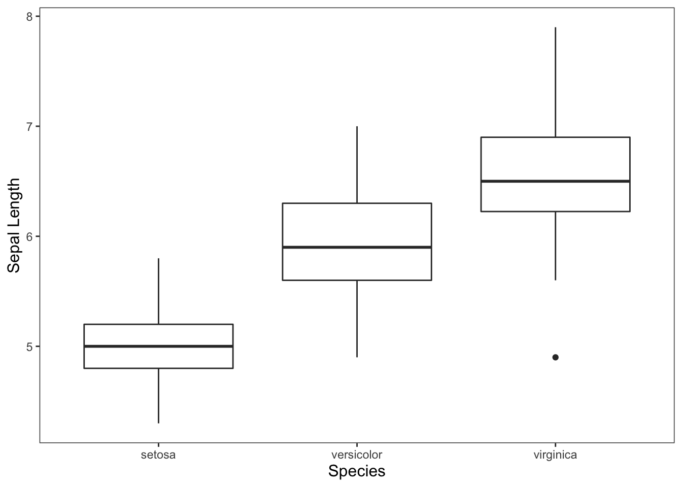
Figure: Simple box plot.
While not necessary, you can also add colors to your boxplots, but you’ll probably want to get rid of the unnecessary legend.
ggplot(data = iris, mapping = aes(x = Species, y = Sepal.Length)) +
  geom_boxplot(aes(fill = Species)) +
  theme_apa(legend.pos = "none") +
  scale_fill_brewer(palette = "Dark2") +
  labs(x = "Species", y = "Sepal Length")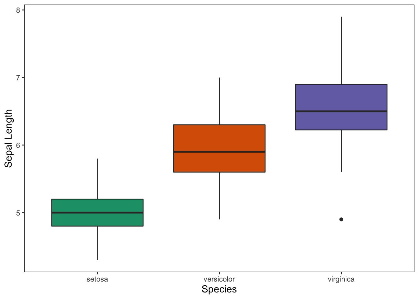
Figure: Box plot with color and no legend.
2.5 Bar Graphs
These graphs are handy for showing means for groups in your data.
ggplot(data = iris, mapping = aes(x = Species, y = Sepal.Length)) +
  geom_bar(position = "dodge", stat = "summary", fun.y = "mean") +
  geom_errorbar(stat = "summary", position = "dodge", width = 0.2, fun.data = "mean_cl_normal") +
  theme_apa() +
  labs(x = "# of Cylinders", y = "Miles Per Gallon (mpg)")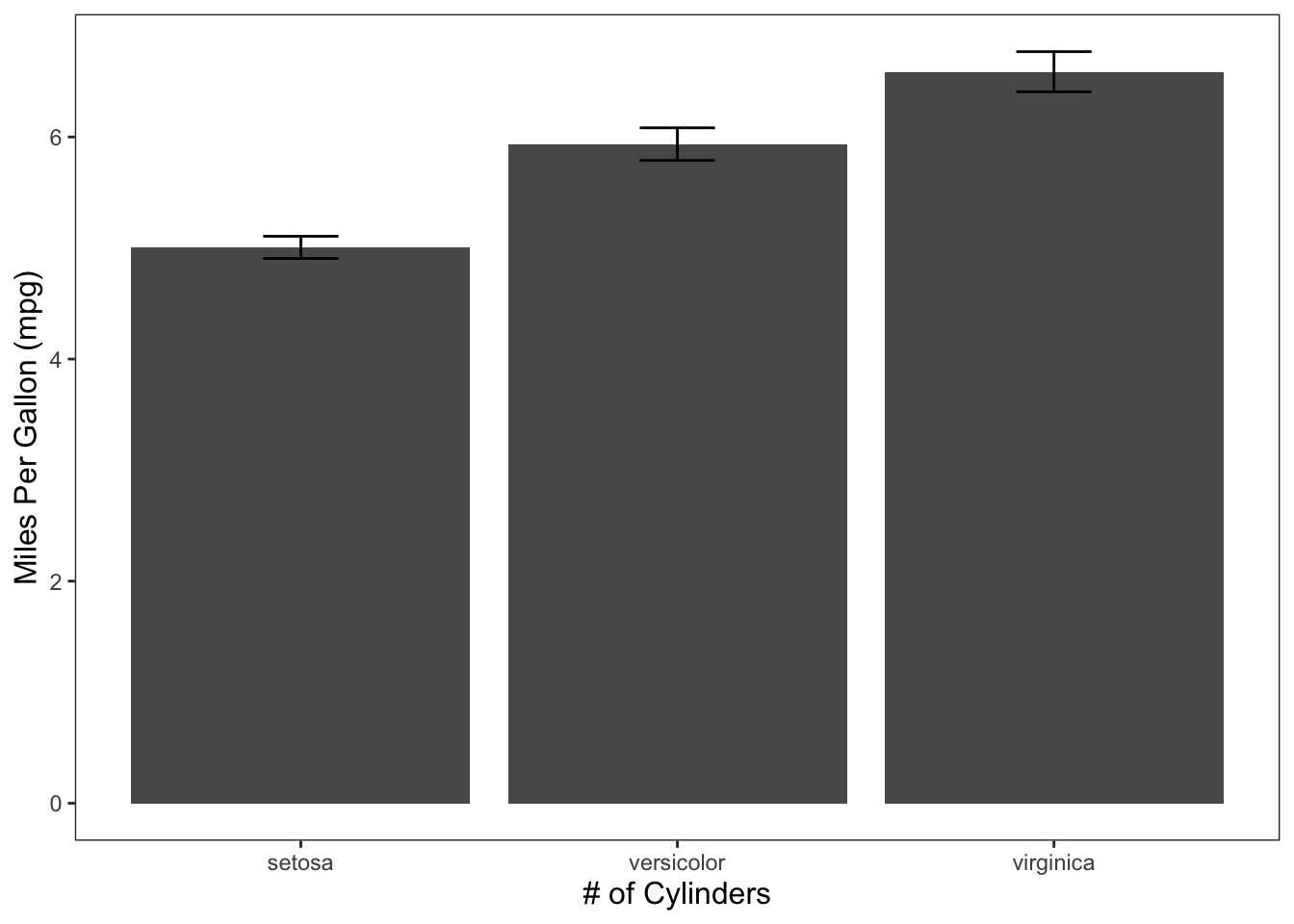
Figure: Bar graph with error bars.
Don’t forget that we can include additional variables if we need to through facetting or additional aesthetics.
2.5.1 Facet
ggplot(data = diamonds, mapping = aes(x = color, y = price)) +
  geom_bar(position = "dodge", stat = "summary", fun.y = "mean") +
  geom_errorbar(stat = "summary", position = "dodge", fun.data = "mean_cl_normal") +
  theme_apa(legend.use.title = TRUE) +
  facet_wrap(~ cut) +
  labs(x = "Color", y = "Price")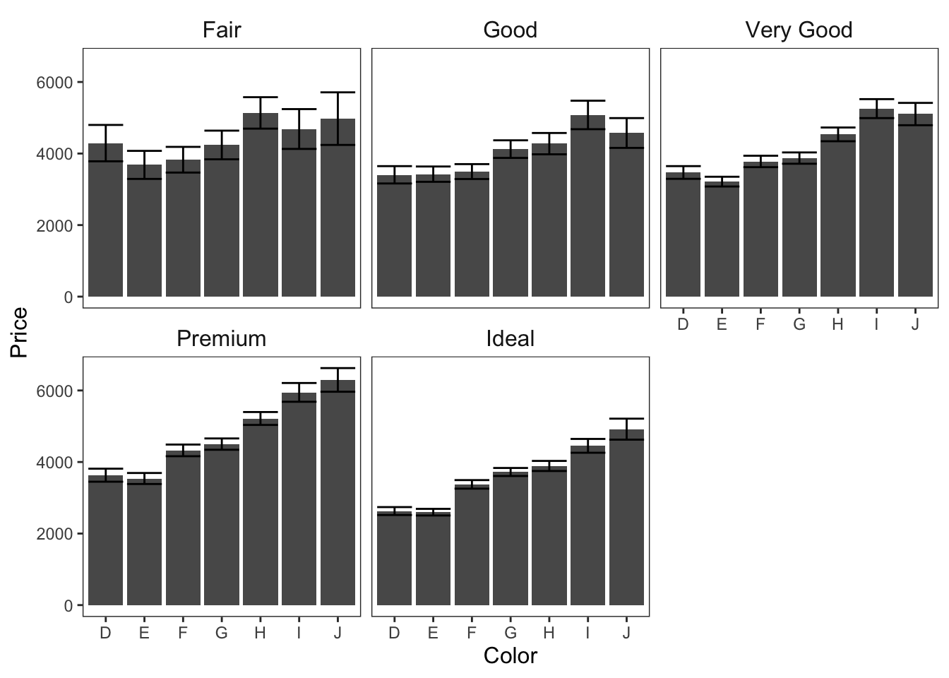
Figure: Bar graphs faceted on cut.
2.5.2 Fill
ggplot(data = diamonds, mapping = aes(x = cut, y = price, fill = color)) +
  geom_bar(position = "dodge", stat = "summary", fun.y = "mean") +
  geom_errorbar(stat = "summary", position = "dodge", fun.data = "mean_cl_normal") +
  theme_apa(legend.use.title = TRUE) +
  labs(x = "Cut", y = "Price", fill = "Color")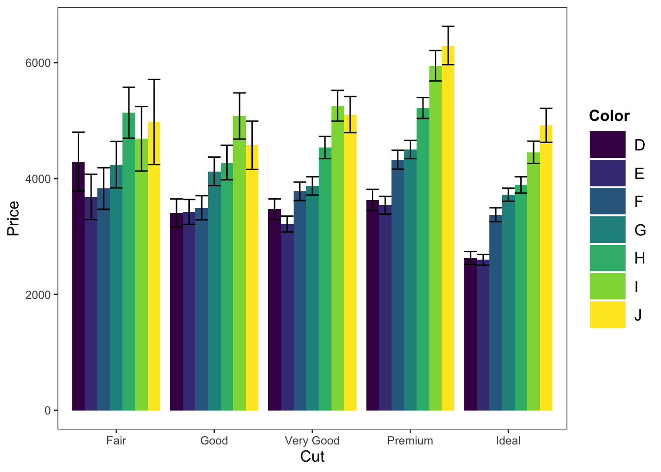
Figure: Bar graph with color fill.
2.6 Line Graphs
Line graphs are particularly useful for displaying trends over time.
In this graph, we’re showing the mean change in circumference across time for 5 trees.
ggplot(data = Orange, mapping = aes(x = age, y = circumference)) +
  geom_line(position = "dodge", stat = "summary", fun.y = "mean") +
  geom_errorbar(stat = "summary", position = "dodge", fun.data = "mean_cl_normal") +
  theme_apa(legend.use.title = TRUE) +
  labs(x = "Age (in days)", y = "Circumference (in mm)")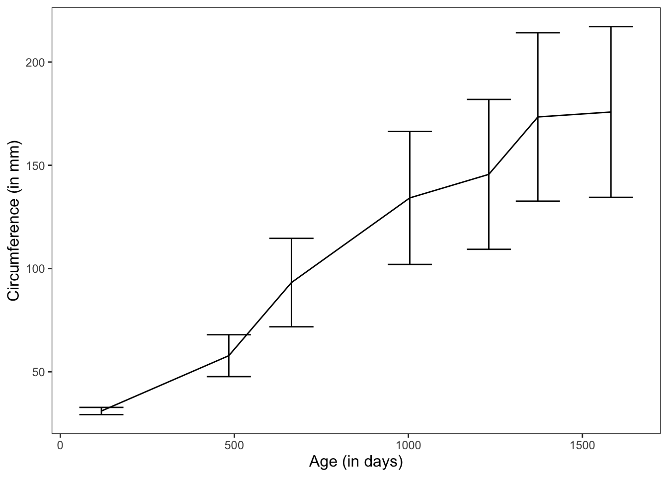
Figure: Line graph with error bars.
In this graph, we’re showing the change in circumference across time for the 5 individual trees.
Note: There are no errorbars here because we’re graphing individual measurements, not means.
ggplot(data = Orange, mapping = aes(x = age, y = circumference, color = Tree)) +
  geom_line(position = "dodge", stat = "summary", fun.y = "mean") +
  theme_apa(legend.use.title = TRUE) +
  labs(x = "Age (in days)", y = "Circumference (in mm)")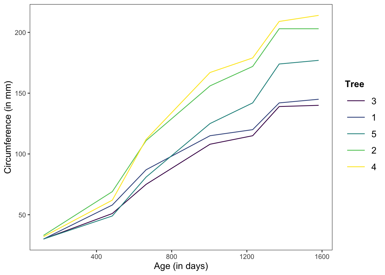
Figure: Line graph without error bars.
Let’s make a graph (with different data) that has a bit more flair and shows off some of our other options
ggplot(data = Vocab, mapping = aes(x = year, y = education, color = sex, shape = sex)) +
  geom_line(aes(linetype = sex), position = "dodge", stat = "summary", fun.y = "mean") +
  scale_linetype_manual(values = c("longdash", "dotted")) +
  stat_summary(fun.y = mean, geom = "point", position = "dodge") +
  scale_shape_manual(values = c(15, 17)) +
  geom_errorbar(stat = "summary", position = "dodge", fun.data = "mean_cl_normal") +
  theme_apa(legend.pos = "bottom") +
  scale_color_brewer(palette = "Dark2") +
  labs(x = "Year Collected", y = "Education (number of years)")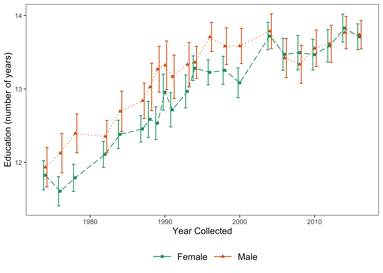
Figure: Line graph with error bars, color, shape, and linetype.
3 Specialized Graphs
In this section, we’ll talk about more complex, but also informative, graphs.
This section will be pulling heavily from information found on the internet, and some graphs will require some setup before making the actual graph.
This page is super nifty.
3.1 Raincloud Plots
A guide specifically for creating these plots can be found here.
This graph will take a bit of setup to make. First, we need to create the necessary theme for this:
raincloud_theme = theme(
  text = element_text(size = 10),
  axis.title.x = element_text(size = 16),
  axis.title.y = element_text(size = 16),
  axis.text = element_text(size = 14),
  axis.text.x = element_text(angle = 45, vjust = 0.5),
  legend.title=element_text(size=16),
  legend.text=element_text(size=16),
  legend.position = "right",
  plot.title = element_text(lineheight=.8, face="bold", size = 16),
  panel.border = element_blank(),
  panel.grid.minor = element_blank(),
  panel.grid.major = element_blank(),
  axis.line.x = element_line(colour = 'black', size=0.5, linetype='solid'),
  axis.line.y = element_line(colour = 'black', size=0.5, linetype='solid'))
We then need to write a function to allow us to create one of the main elements of the raincloud graph - the flat violin plot.
geom_flat_violin <- function(mapping = NULL, data = NULL, stat = "ydensity",
                             position = "dodge", trim = TRUE, scale = "area",
                             show.legend = NA, inherit.aes = TRUE, ...) {
  layer(
    data = data,
    mapping = mapping,
    stat = stat,
    geom = GeomFlatViolin,
    position = position,
    show.legend = show.legend,
    inherit.aes = inherit.aes,
    params = list(
      trim = trim,
      scale = scale,
      ...
    )
  )
}
GeomFlatViolin <-
  ggproto("GeomFlatViolin", Geom,
          setup_data = function(data, params) {
            data$width <- data$width %||%
              params$width %||% (resolution(data$x, FALSE) * 0.9)

            # ymin, ymax, xmin, and xmax define the bounding rectangle for each group
            data %>%
              group_by(group) %>%
              mutate(ymin = min(y),
                     ymax = max(y),
                     xmin = x,
                     xmax = x + width / 2)

          },

          draw_group = function(data, panel_scales, coord) {
            # Find the points for the line to go all the way around
            data <- transform(data, xminv = x,
                              xmaxv = x + violinwidth * (xmax - x))

            # Make sure it's sorted properly to draw the outline
            newdata <- rbind(plyr::arrange(transform(data, x = xminv), y),
                             plyr::arrange(transform(data, x = xmaxv), -y))

            # Close the polygon: set first and last point the same
            # Needed for coord_polar and such
            newdata <- rbind(newdata, newdata[1,])

            ggplot2:::ggname("geom_flat_violin", GeomPolygon$draw_panel(newdata, panel_scales, coord))
          },

          draw_key = draw_key_polygon,

          default_aes = aes(weight = 1, colour = "grey20", fill = "white", size = 0.5,
                            alpha = NA, linetype = "solid"),

          required_aes = c("x", "y")
  )
We then need to calculate some summary statistics that will be used in the graph.
lb <- function(x) mean(x) - sd(x)
ub <- function(x) mean(x) + sd(x)

sumld<- ddply(diamonds, ~cut, summarise,
              mean = mean(price),
              median = median(price),
              lower = lb(price),
              upper = ub(price))

head(sumld)
## cut mean median lower upper
## 1 Fair 4358.758 3282.0 798.37115 7919.144
## 2 Good 3928.864 3050.5 247.27487 7610.454
## 3 Very Good 3981.760 2648.0 45.89773 7917.622
## 4 Premium 4584.258 3185.0 235.05274 8933.463
## 5 Ideal 3457.542 1810.0 -350.85920 7265.943Once we’ve done all of that, we can create our raincloud plot.
ggplot(data = diamonds, aes(y = price, x = cut, fill = cut)) +
  geom_flat_violin(position = position_nudge(x = .2, y = 0), alpha = .8) +
  geom_point(aes(y = price, color = cut), position = position_jitter(width = .15), size = .5, alpha = 0.8) +
  geom_boxplot(width = .1, guides = FALSE, outlier.shape = NA, alpha = 0.5) +
  expand_limits(x = 5.25) +
  guides(fill = FALSE) +
  guides(color = FALSE) +
  scale_color_brewer(palette = "Spectral") +
  scale_fill_brewer(palette = "Spectral") +
  coord_flip() +
  theme_bw() +
  raincloud_theme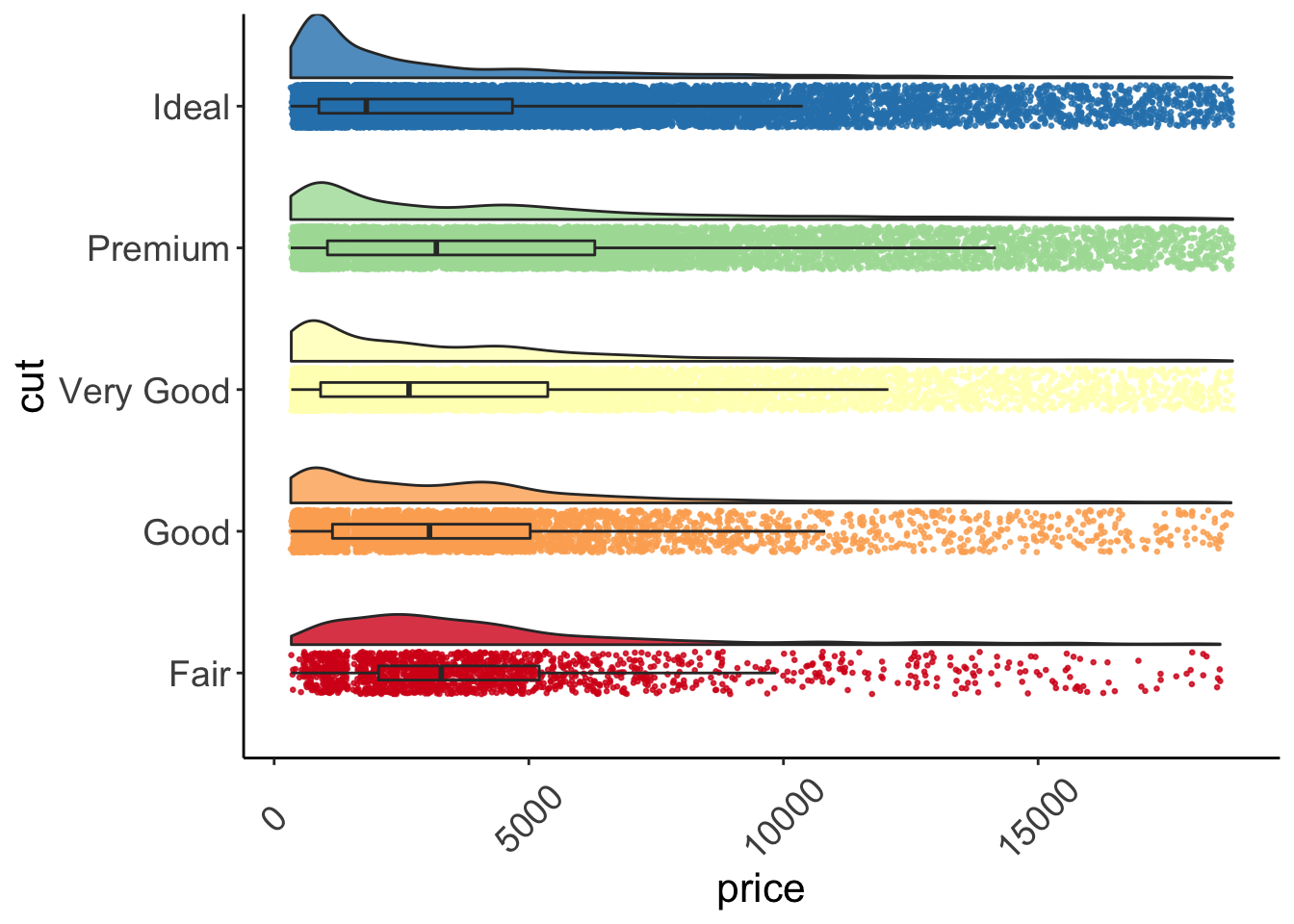
Figure: Raincloud plot.
3.2 Correlogram
More information for this particular type of graph can be found here.
Before making our correlogram, we first need to create a correlation matrix for the data that we plan on using - in this case, mtcars.
corr <- round(cor(mtcars), 1)
corr
## mpg cyl disp hp drat wt qsec vs am gear carb
## mpg 1.0 -0.9 -0.8 -0.8 0.7 -0.9 0.4 0.7 0.6 0.5 -0.6
## cyl -0.9 1.0 0.9 0.8 -0.7 0.8 -0.6 -0.8 -0.5 -0.5 0.5
## disp -0.8 0.9 1.0 0.8 -0.7 0.9 -0.4 -0.7 -0.6 -0.6 0.4
## hp -0.8 0.8 0.8 1.0 -0.4 0.7 -0.7 -0.7 -0.2 -0.1 0.7
## drat 0.7 -0.7 -0.7 -0.4 1.0 -0.7 0.1 0.4 0.7 0.7 -0.1
## wt -0.9 0.8 0.9 0.7 -0.7 1.0 -0.2 -0.6 -0.7 -0.6 0.4
## qsec 0.4 -0.6 -0.4 -0.7 0.1 -0.2 1.0 0.7 -0.2 -0.2 -0.7
## vs 0.7 -0.8 -0.7 -0.7 0.4 -0.6 0.7 1.0 0.2 0.2 -0.6
## am 0.6 -0.5 -0.6 -0.2 0.7 -0.7 -0.2 0.2 1.0 0.8 0.1
## gear 0.5 -0.5 -0.6 -0.1 0.7 -0.6 -0.2 0.2 0.8 1.0 0.3
## carb -0.6 0.5 0.4 0.7 -0.1 0.4 -0.7 -0.6 0.1 0.3 1.0We will then use that to make the correlogram. Note that type = can be "full", "lower", or "upper" depending on your particular preference. Here we will have the full correlogram.
ggcorrplot(corr, hc.order = TRUE,
           type = "full",
           lab = TRUE,
           lab_size = 3,
           method="circle",
           colors = c("tomato2", "white", "springgreen3"),
           title="Correlogram of mtcars",
           ggtheme=theme_bw)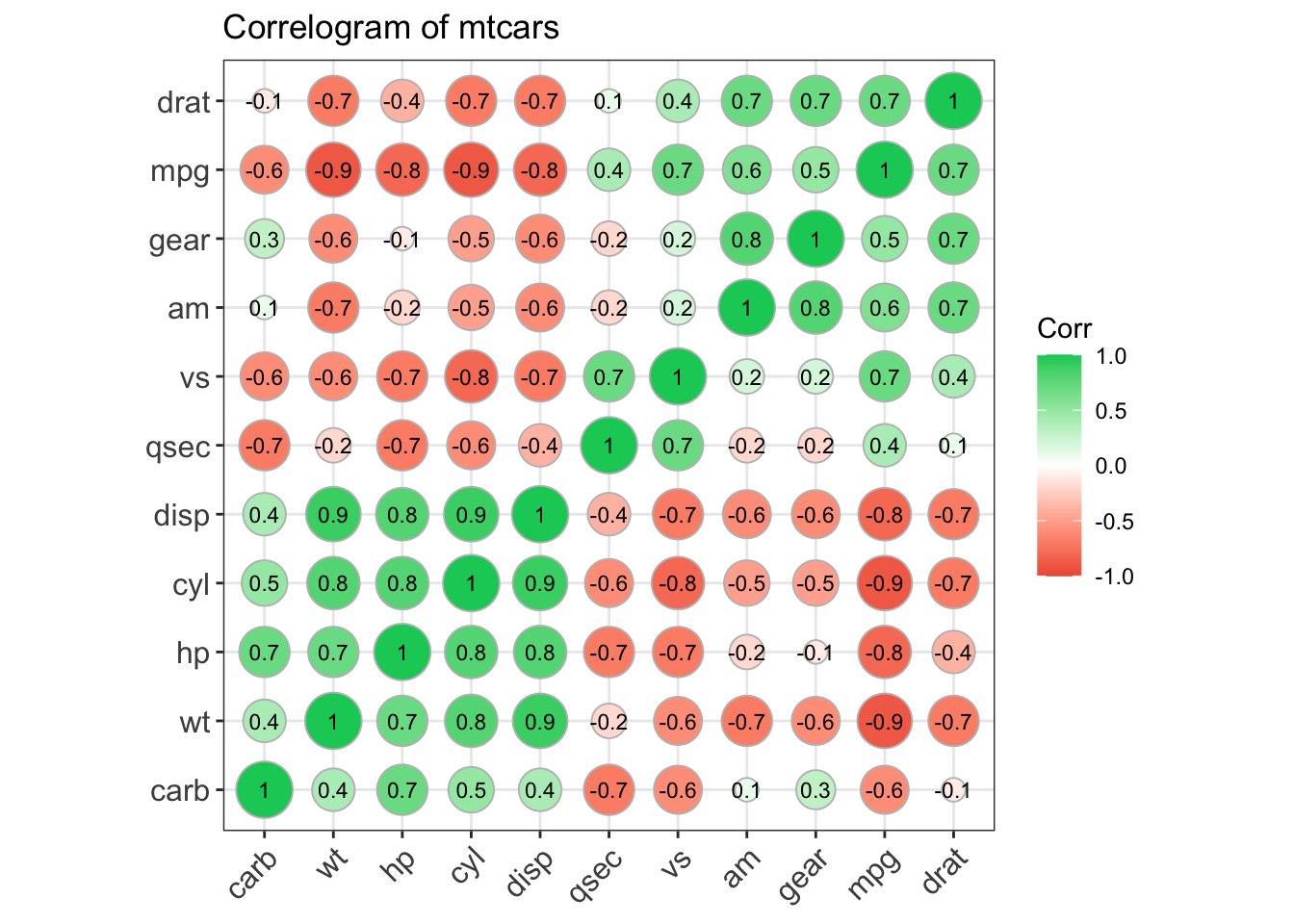
Figure: Full correlogram.
You can find resources for making similar graphs here.
3.3 Correlation Matrix
There are many ways for us to display our correlation matrices. Below is code for one that I particularly like. We can make this visually pleasing correlation matrix with the ggcorr() function from the GGally package.
ggcorr(data = mtcars, nbreaks = 8, palette = "RdBu", name = "rho", label = TRUE,
       label_round = 2, label_color = "black")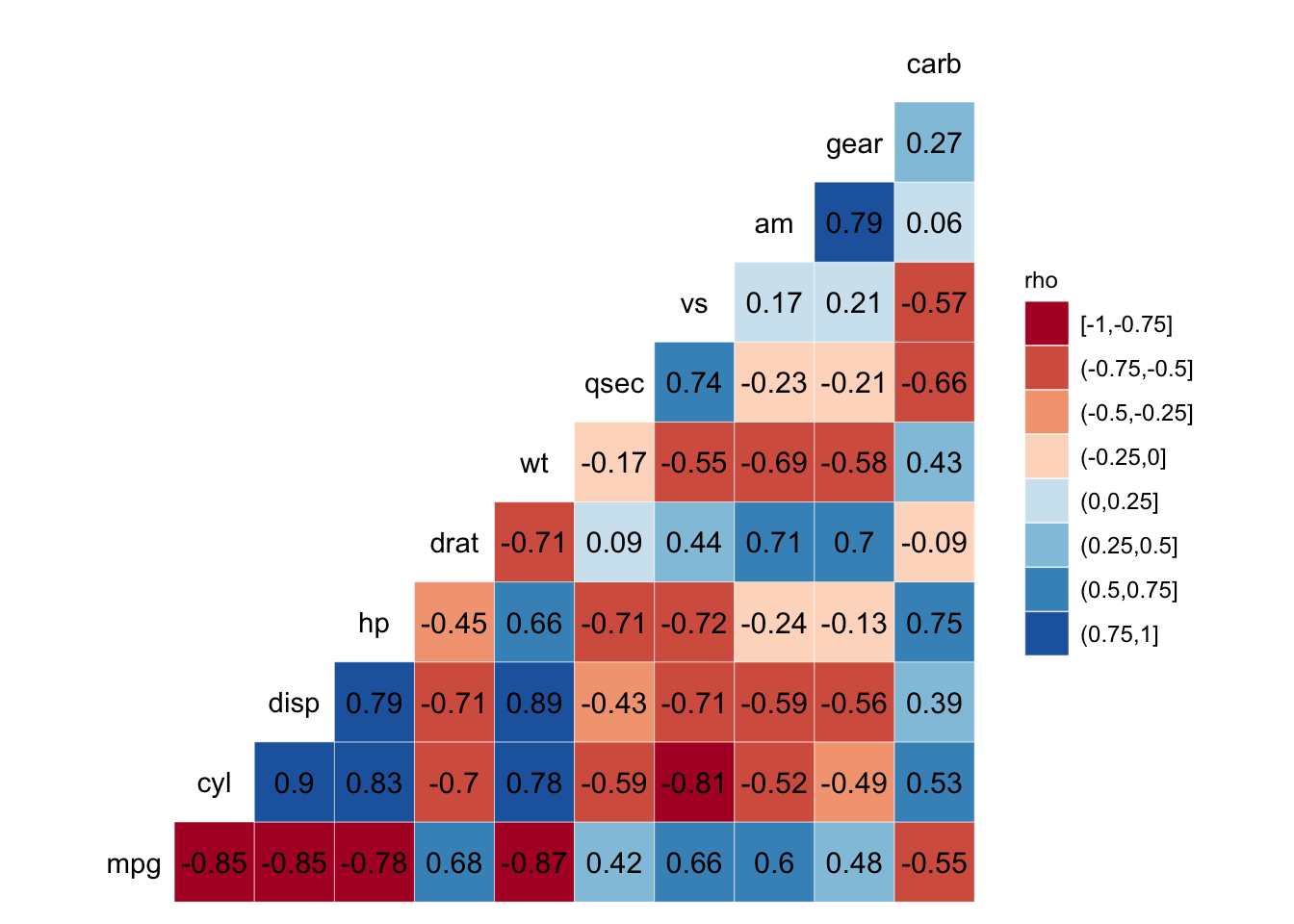
Figure: Correlation matrix.
3.4 Scatterplot Matrix
The GGally package also gives us the ggpairs() function which allows us to easily create scatterplot matrices.
ggpairs(data = mtcars[,c(1, 3, 4, 5, 6, 7)])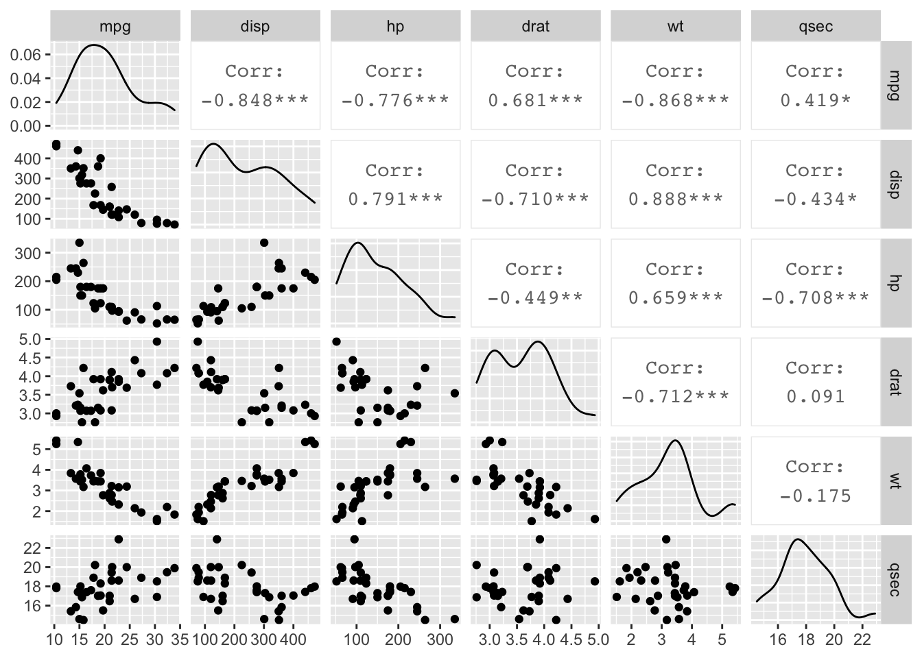
Figure: Scatterplot matrix.
3.5 Marginal Plots
The ggExtra package allows us to create nice looking marginal histogram and marginal boxplot graphs fairly easily.
First, we need to create a scatterplot. Notice that we’re using the geom_count() function here instead of geom_point() - this will change the size of our points based on the count.
g <- ggplot(mpg, aes(cty, hwy)) +
  geom_count() +
  geom_smooth(method="lm", se=F)
We can then use the ggMarginal() function to add the histograms, boxplots, or densities to our scatterplot’s margins.
ggMarginal(g, type = "histogram", fill="transparent")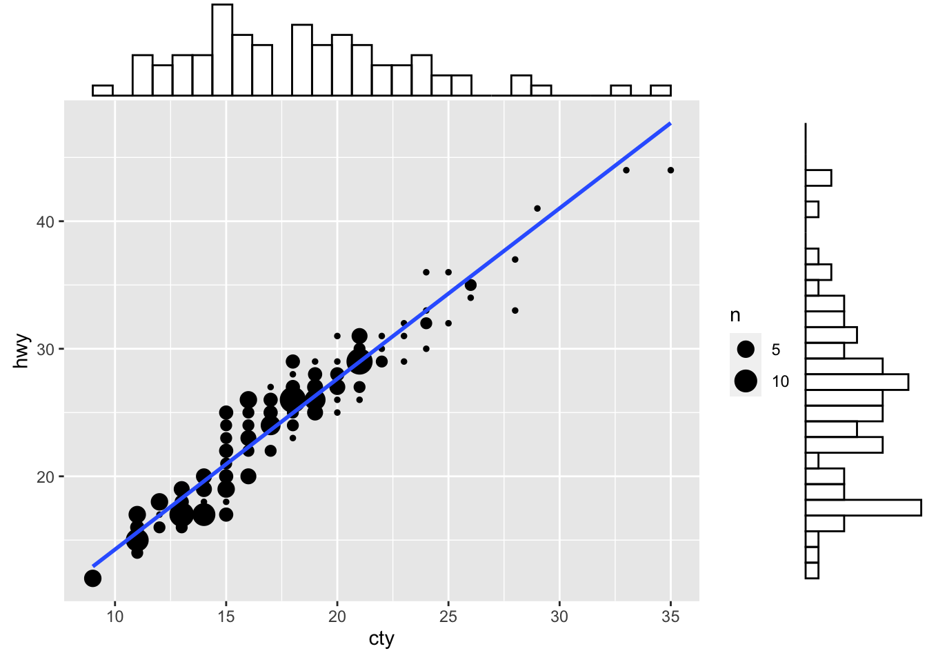
Figure: Scatterplot with marginal histograms.
ggMarginal(g, type = "boxplot", fill="transparent")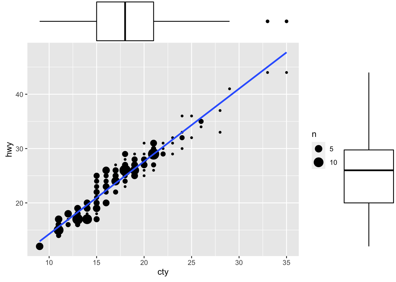
Figure: Scatterplot with marginal box plots.
ggMarginal(g, type = "density", fill="transparent")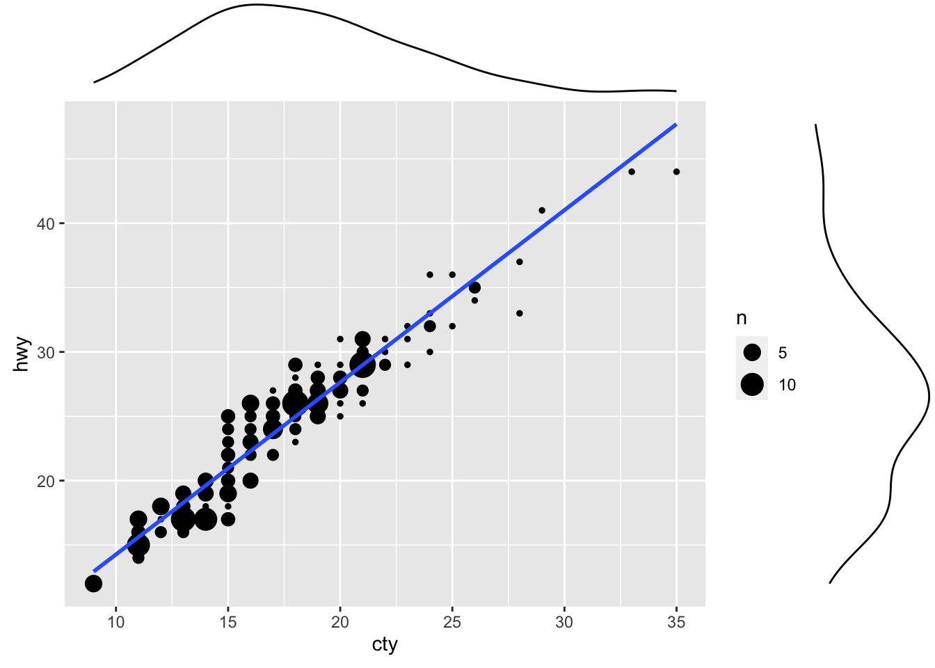
Figure: Scatterplot with marginal density plots.